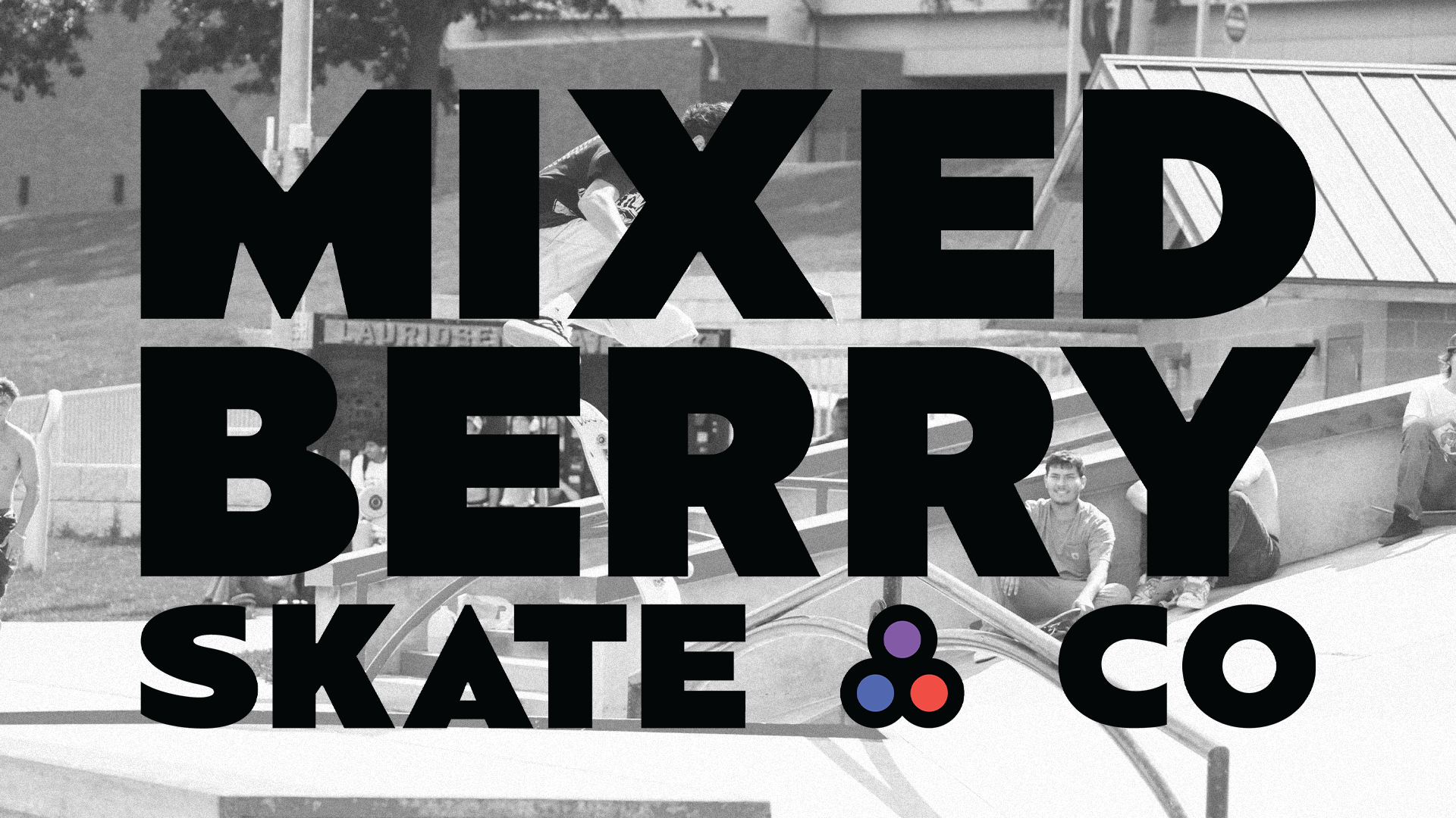
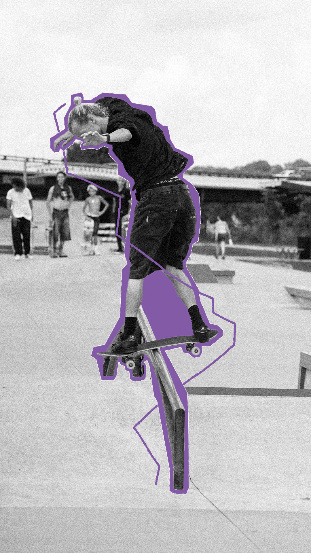
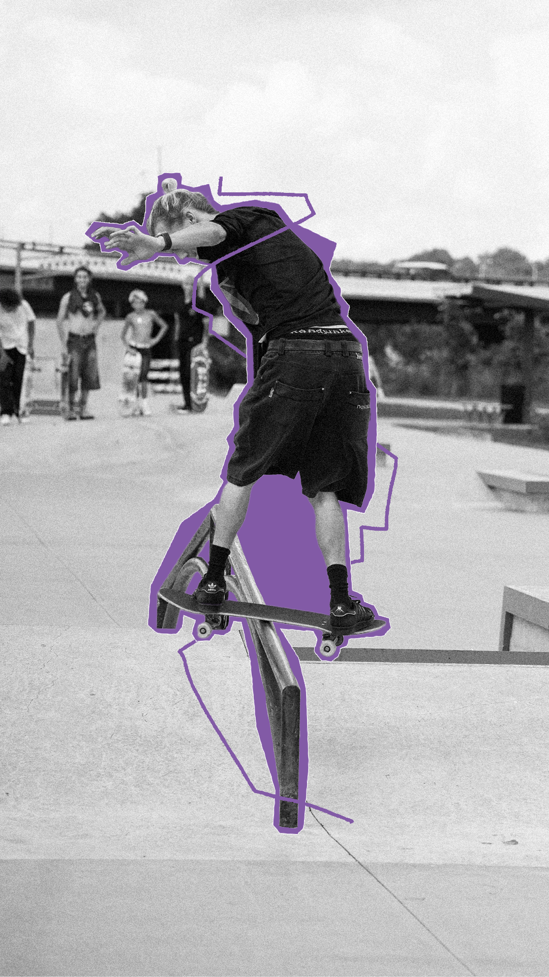
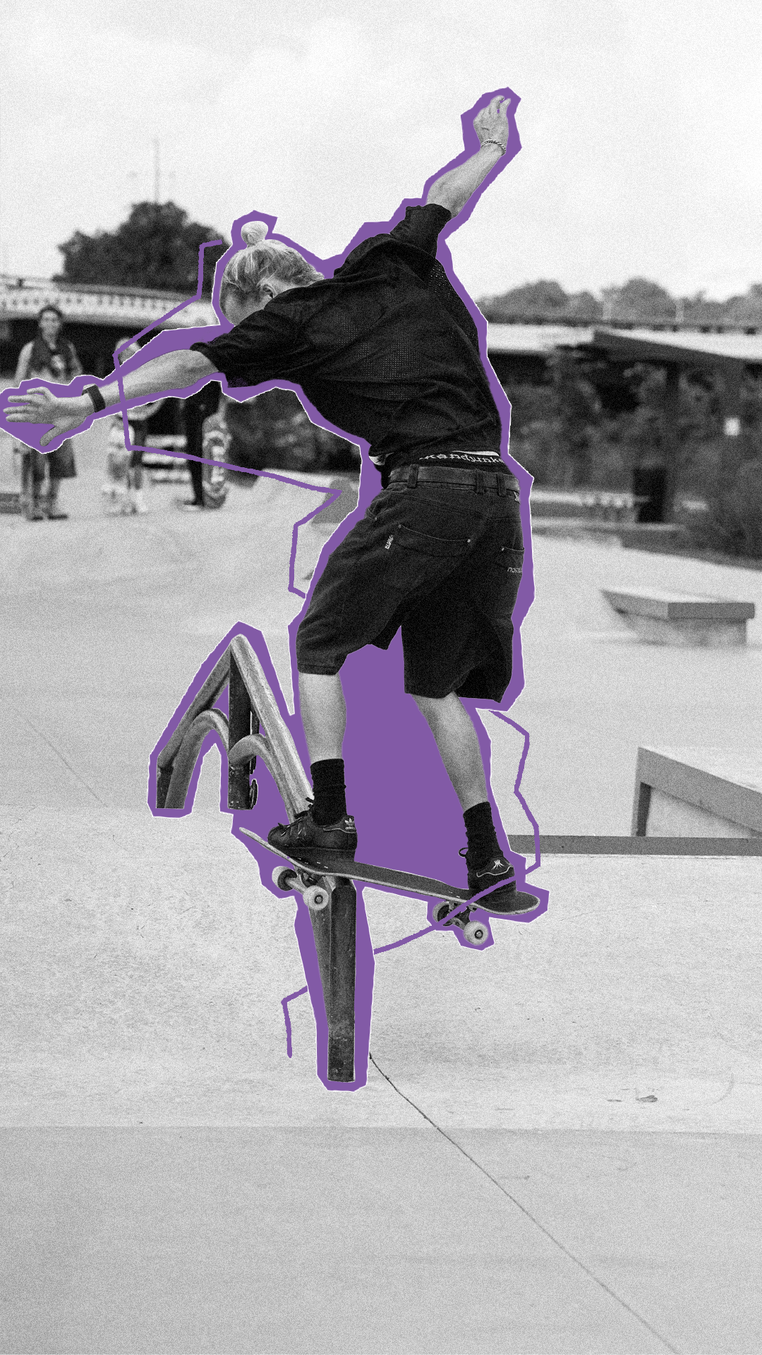
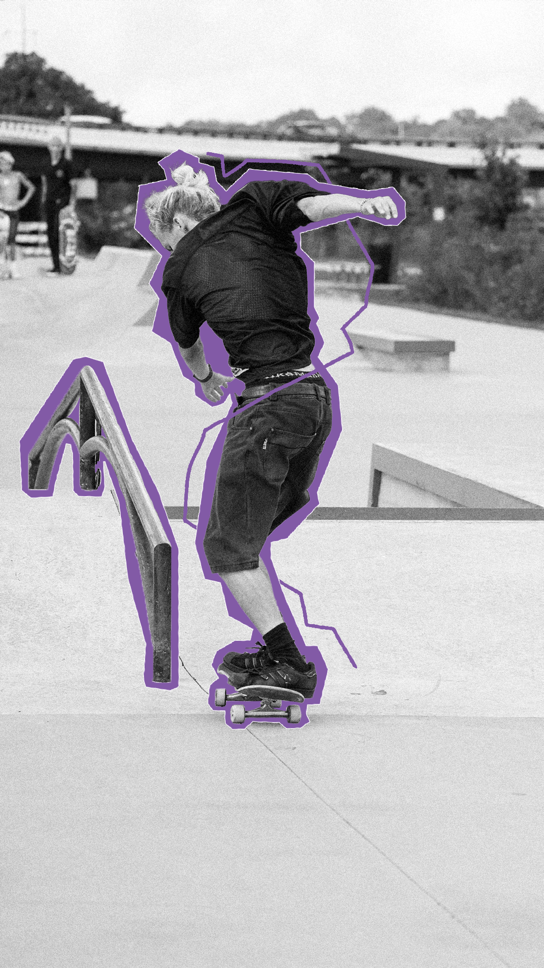
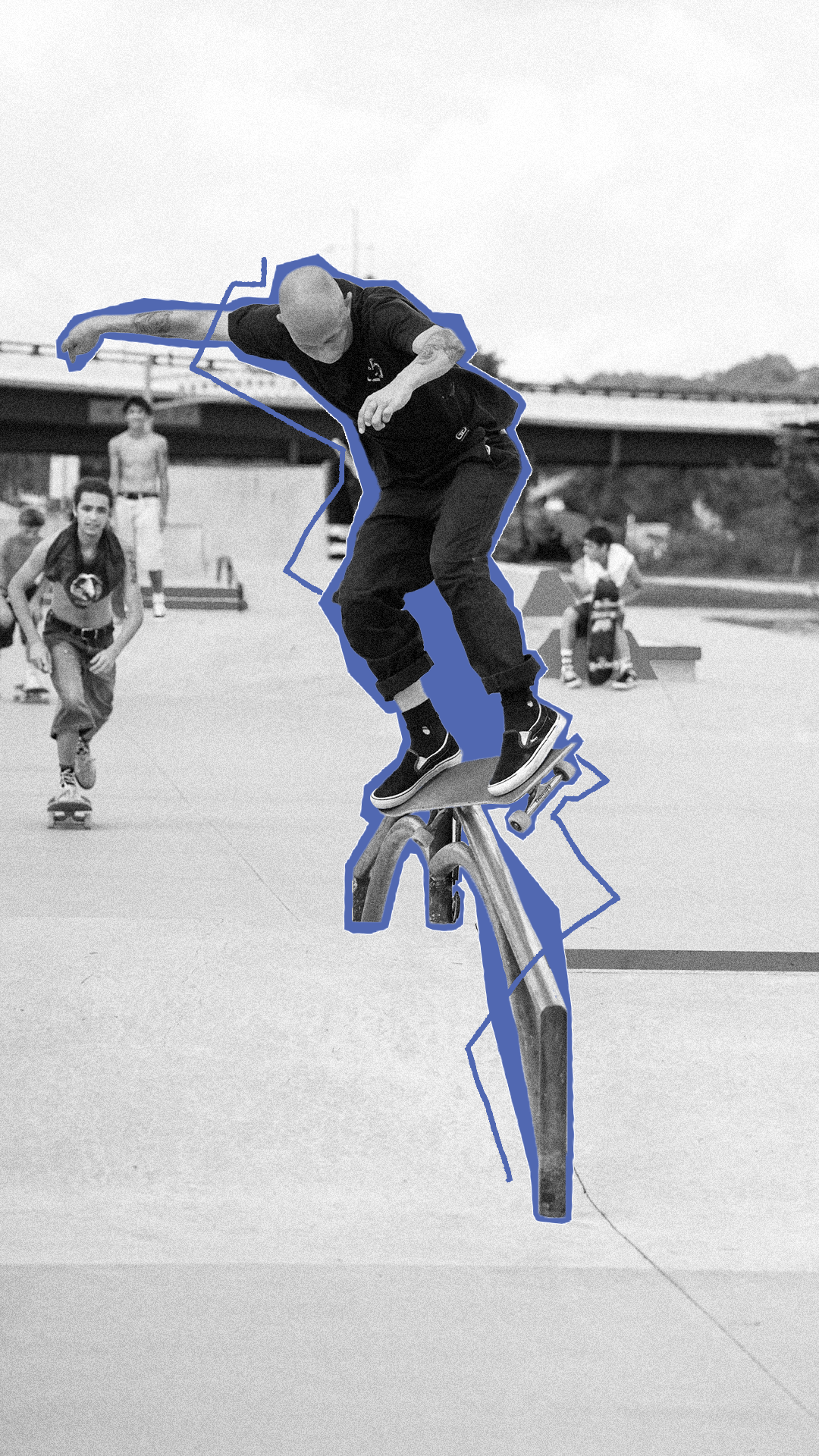
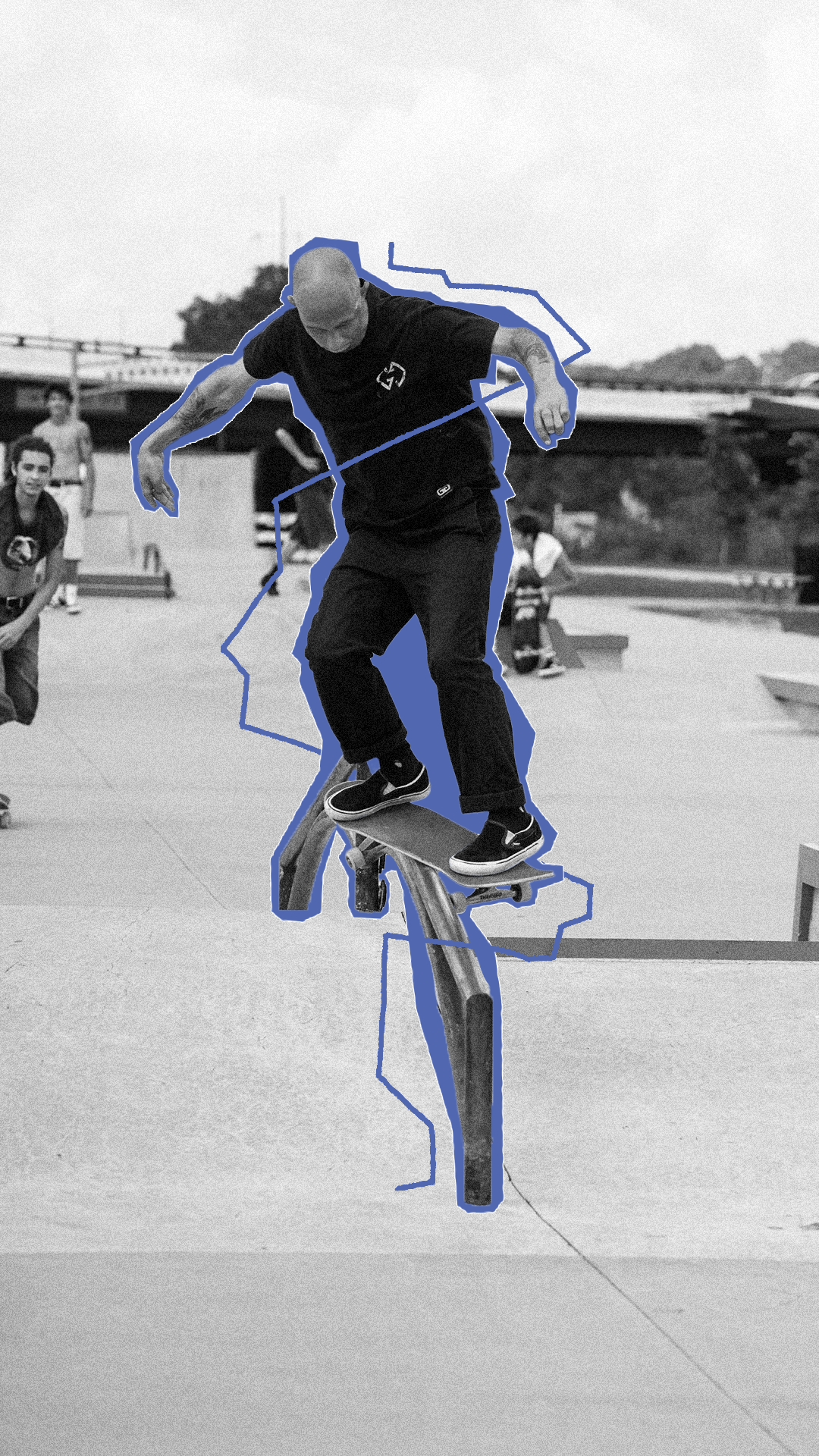
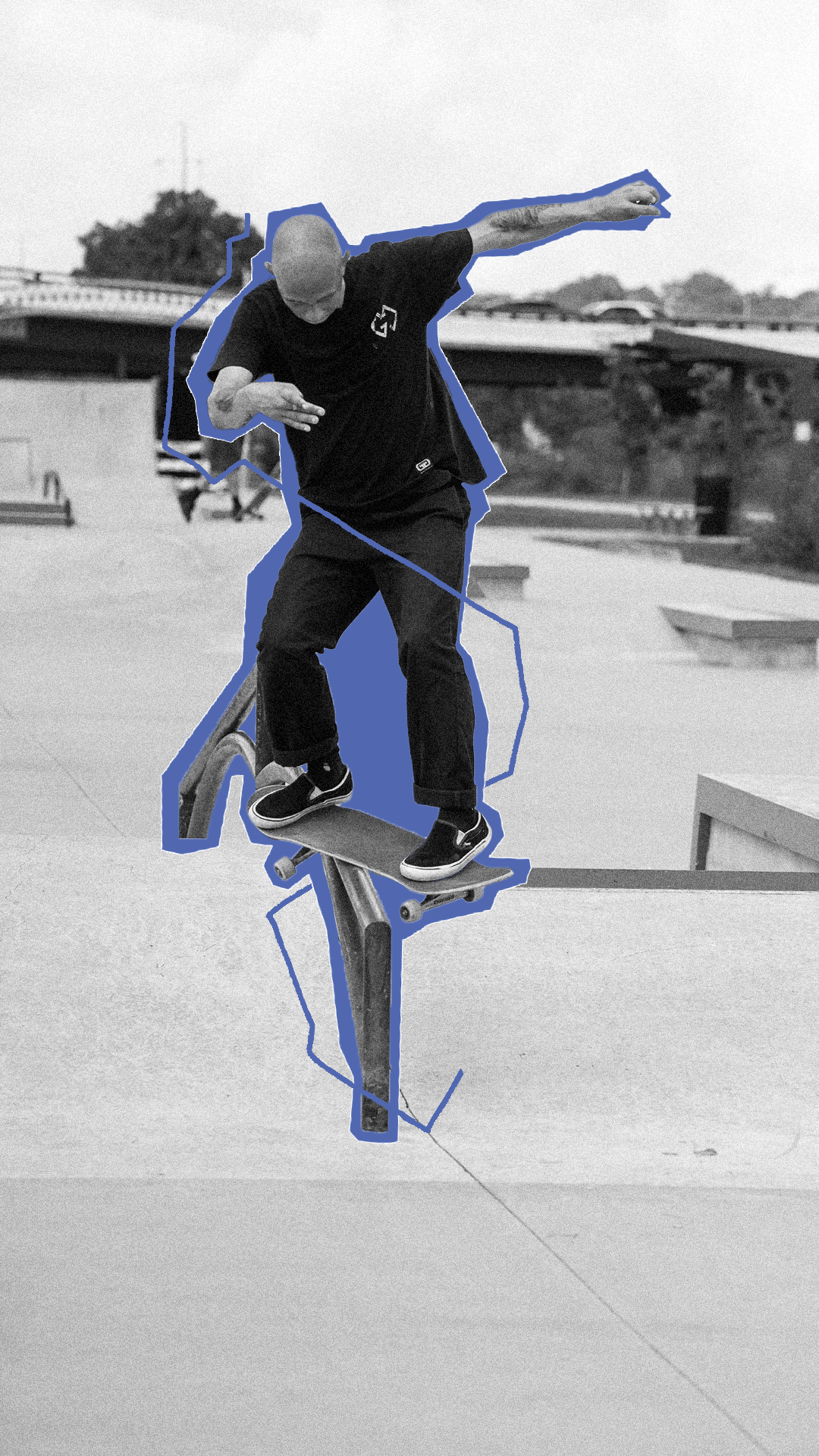
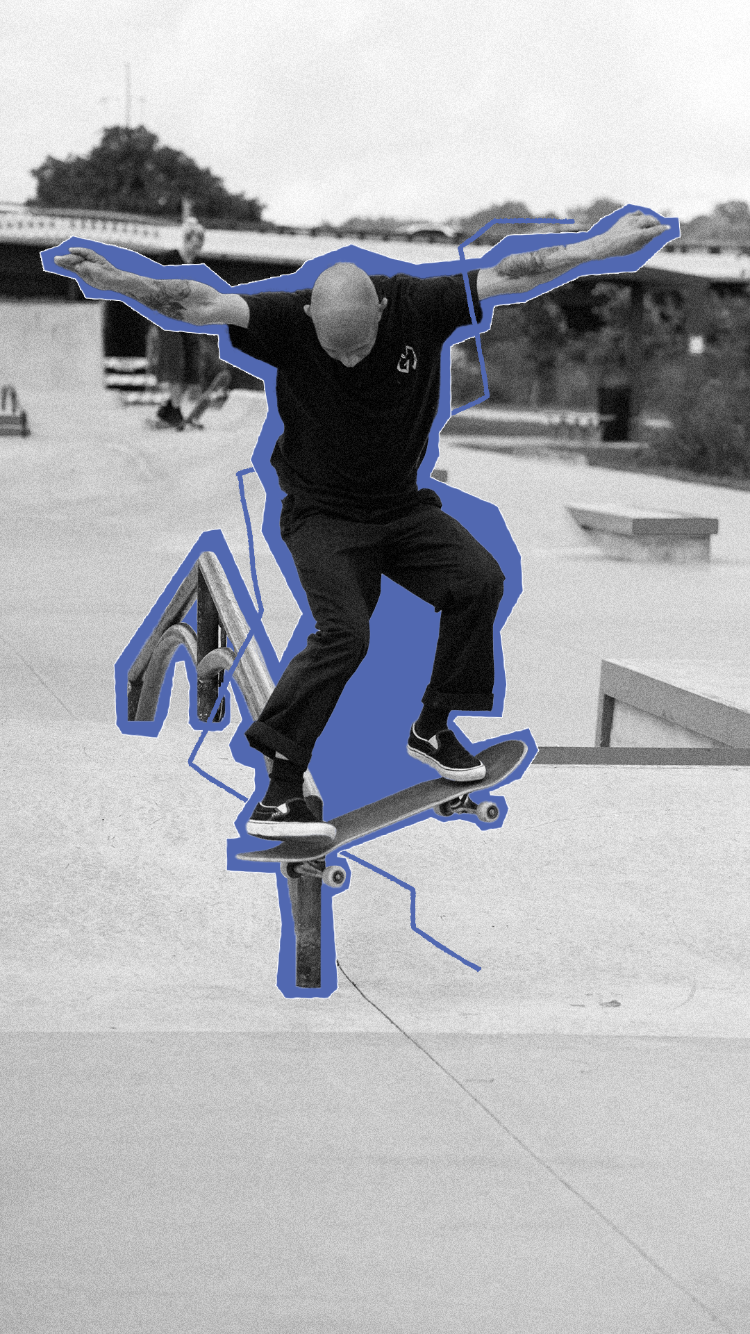
Mixed Berry Skate Co
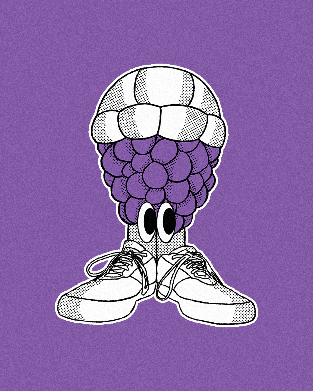
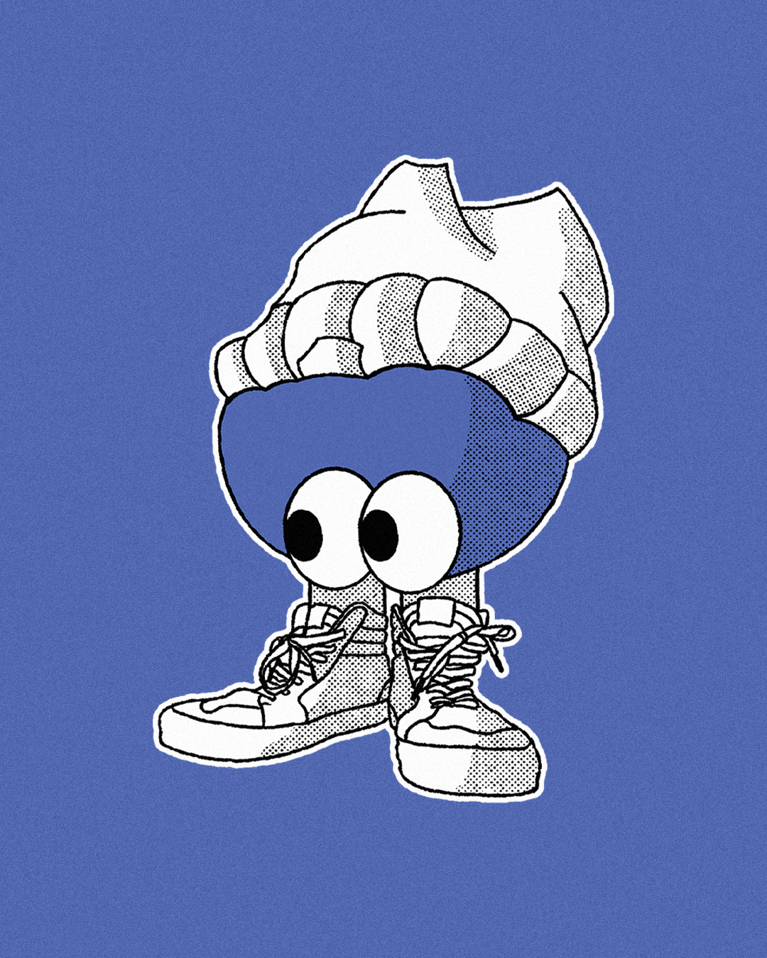
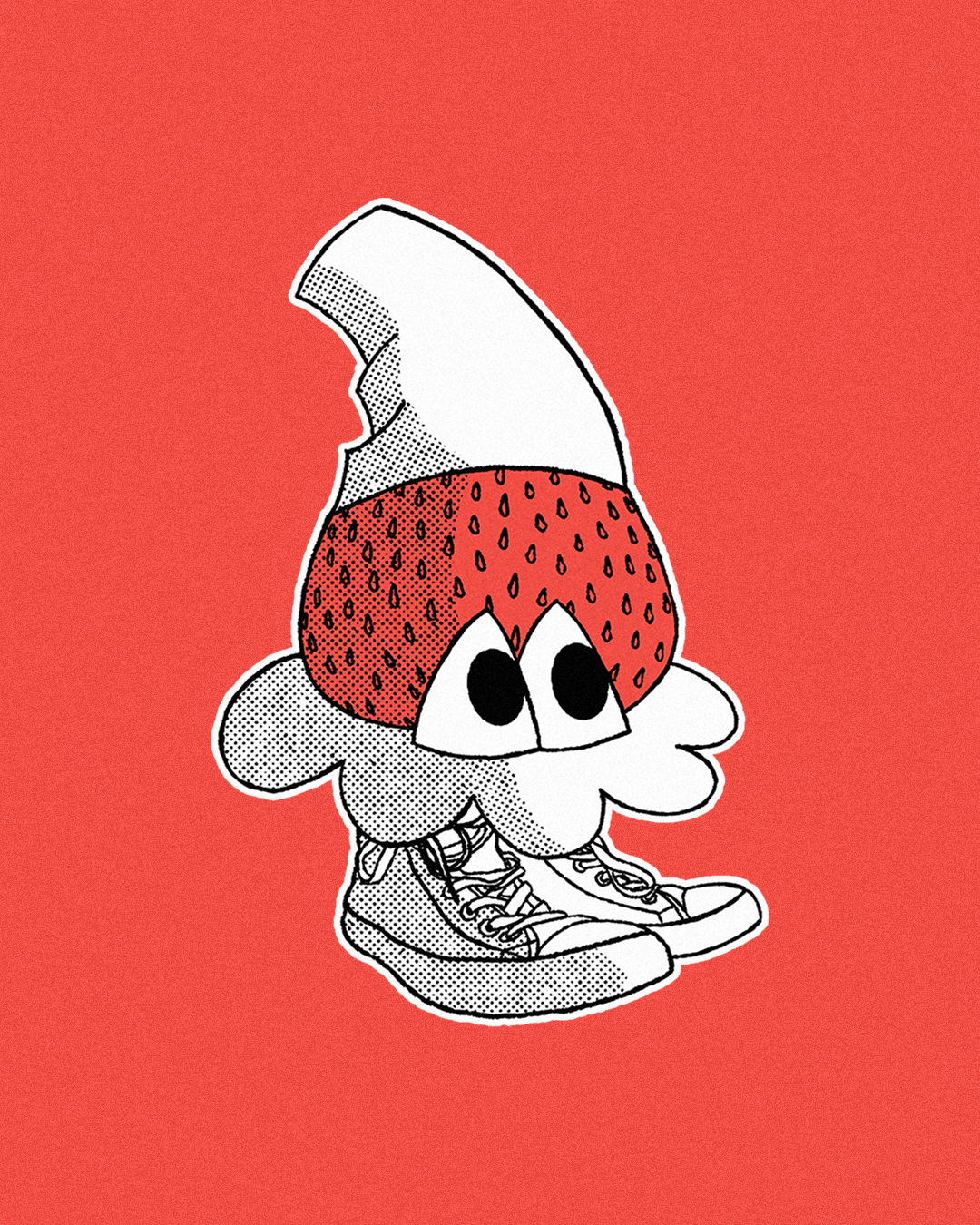
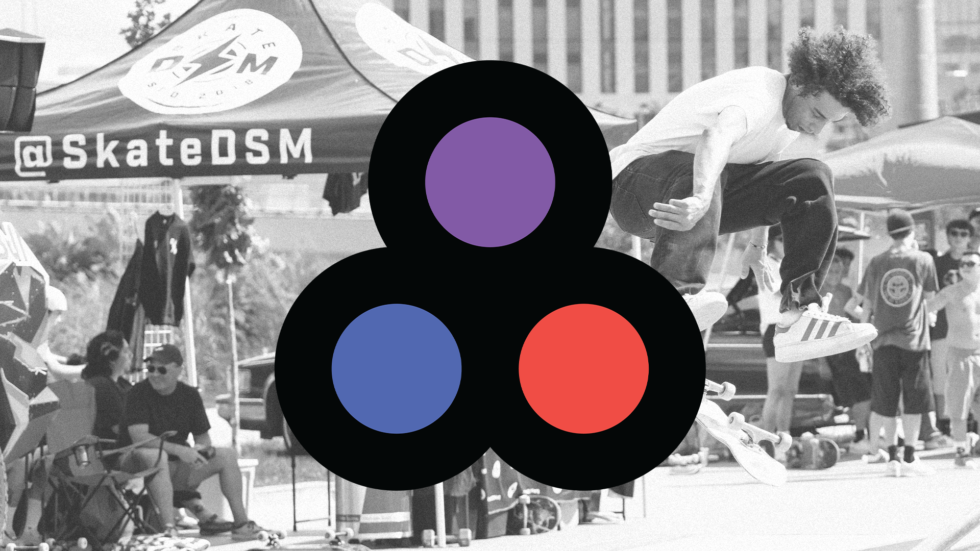
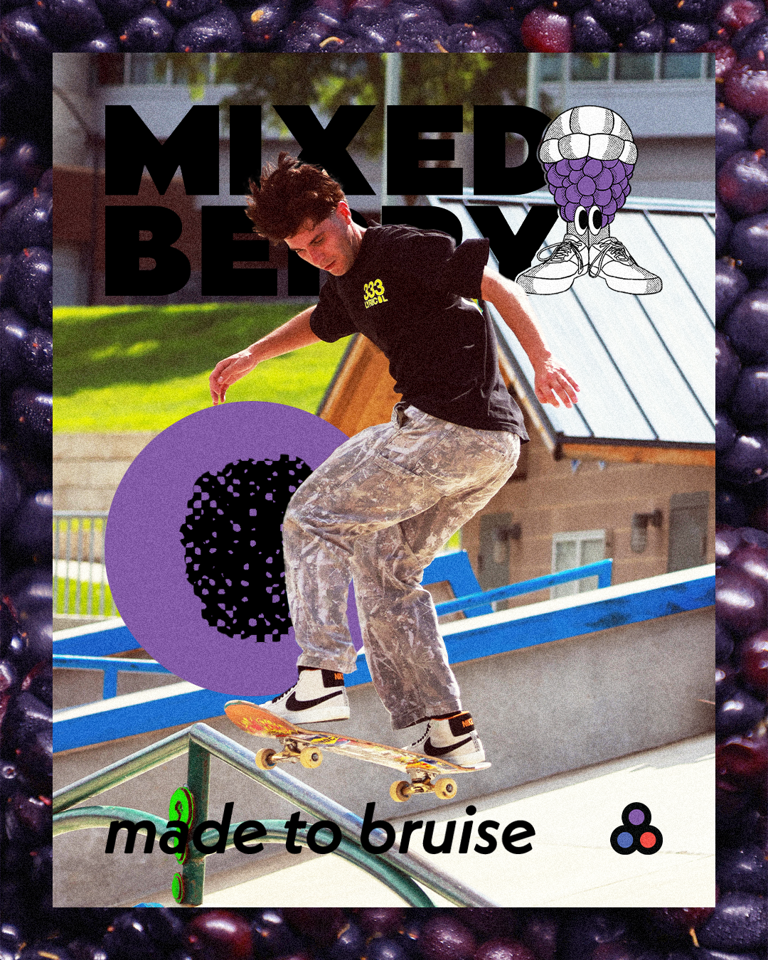
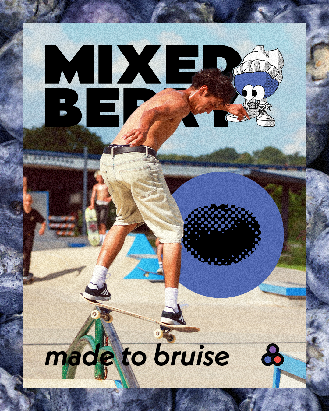
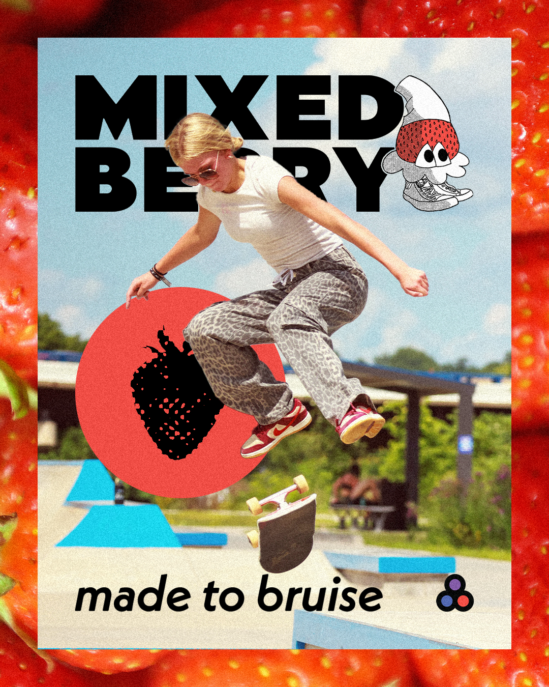
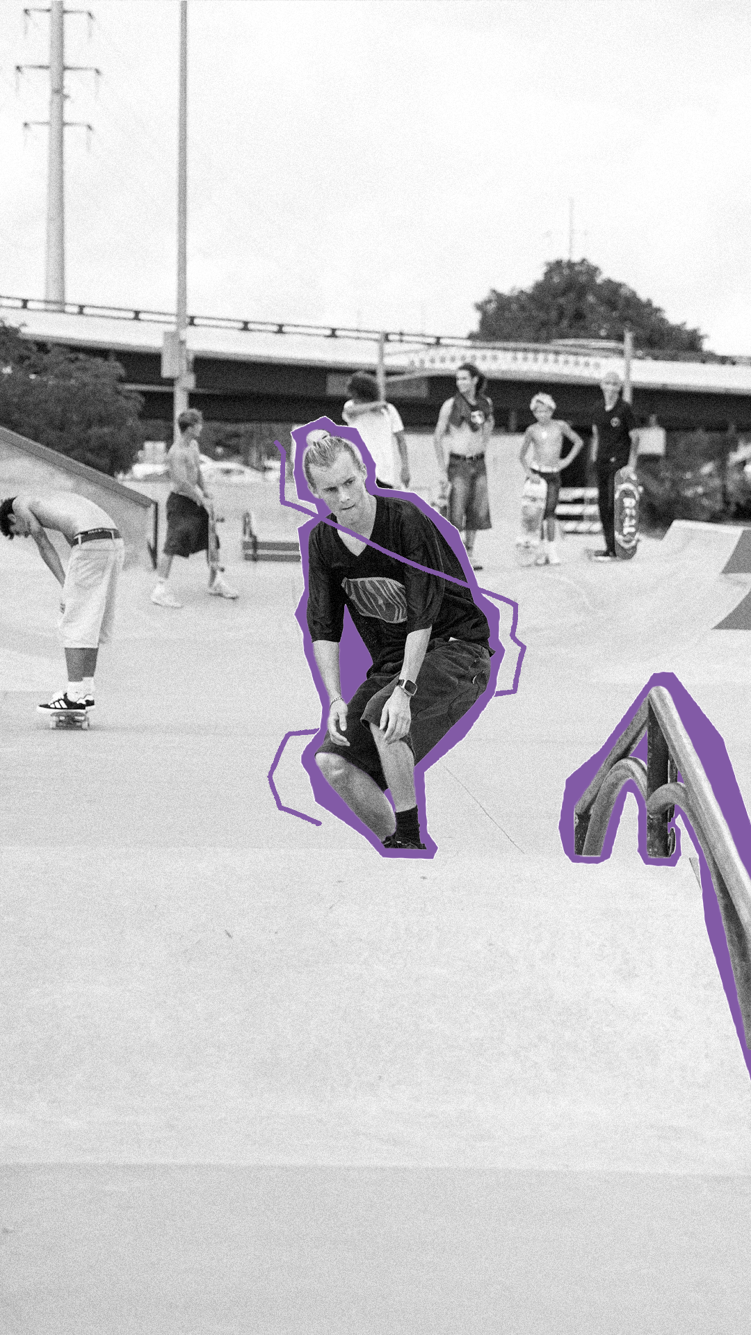
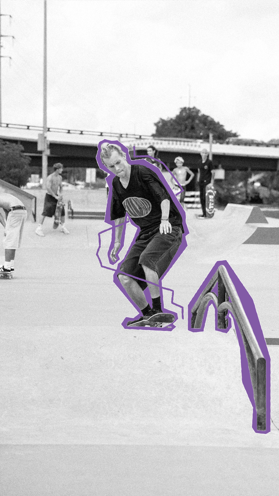
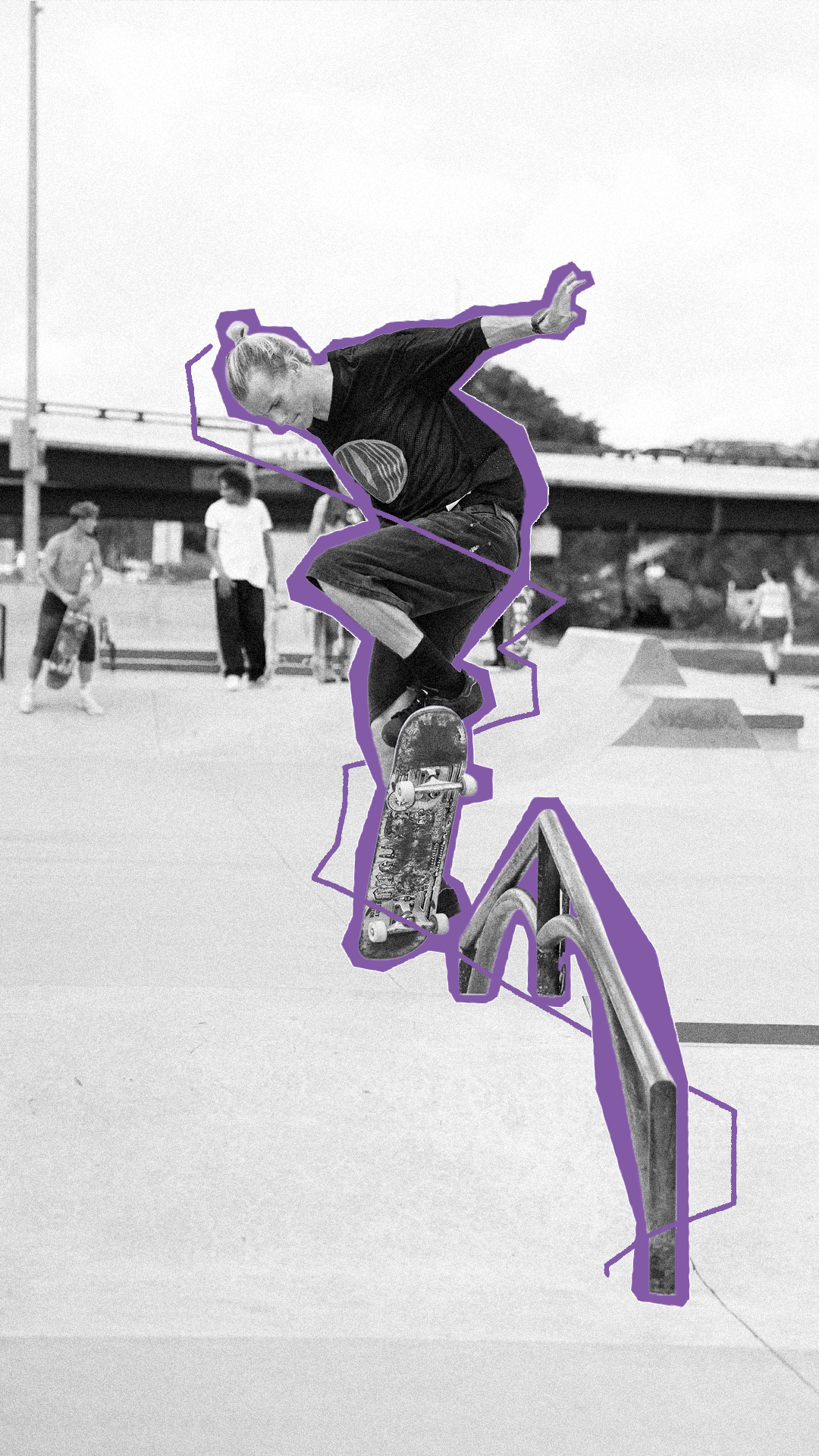
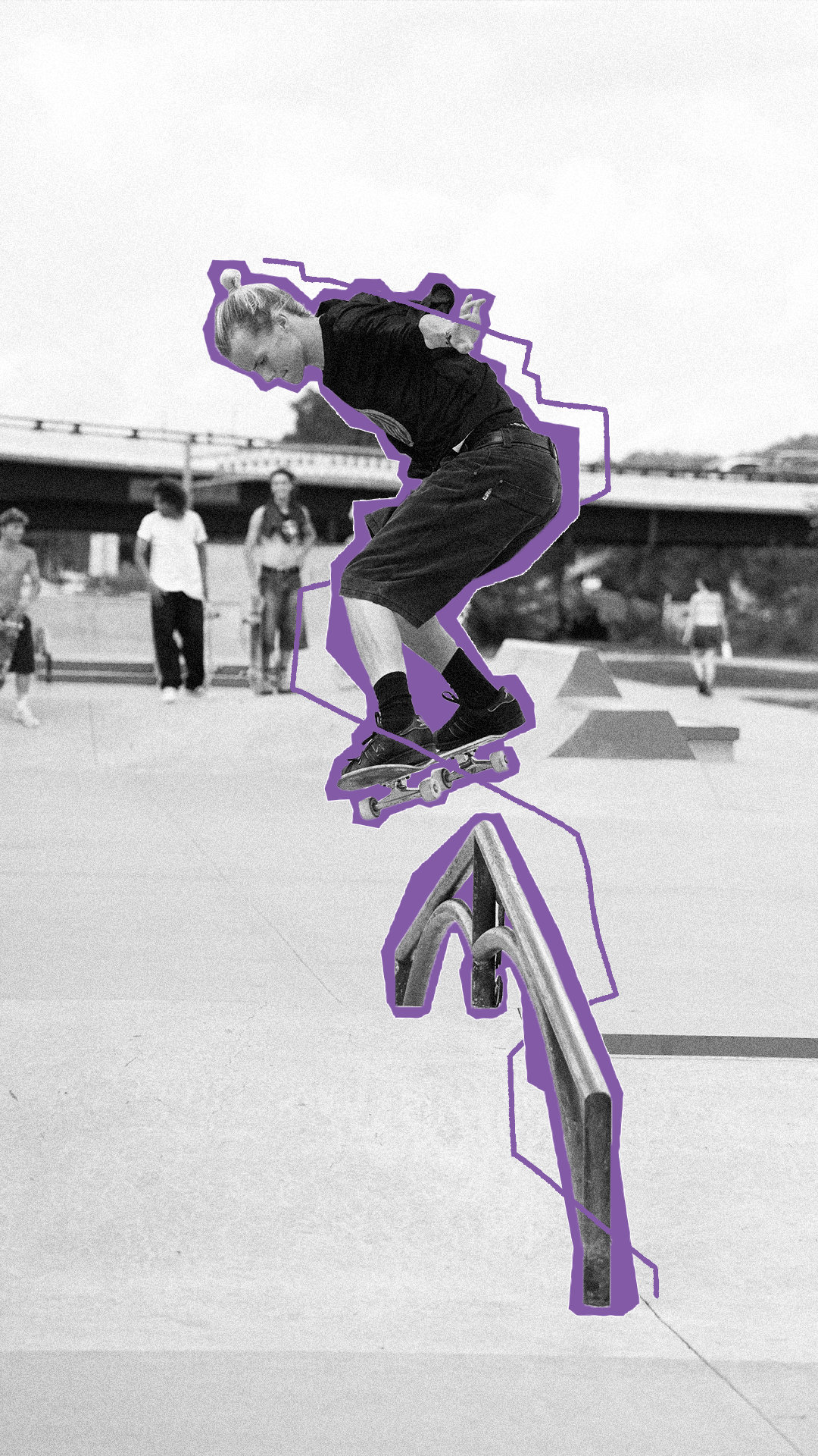
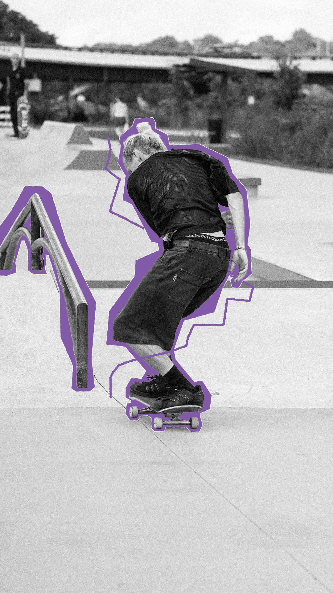
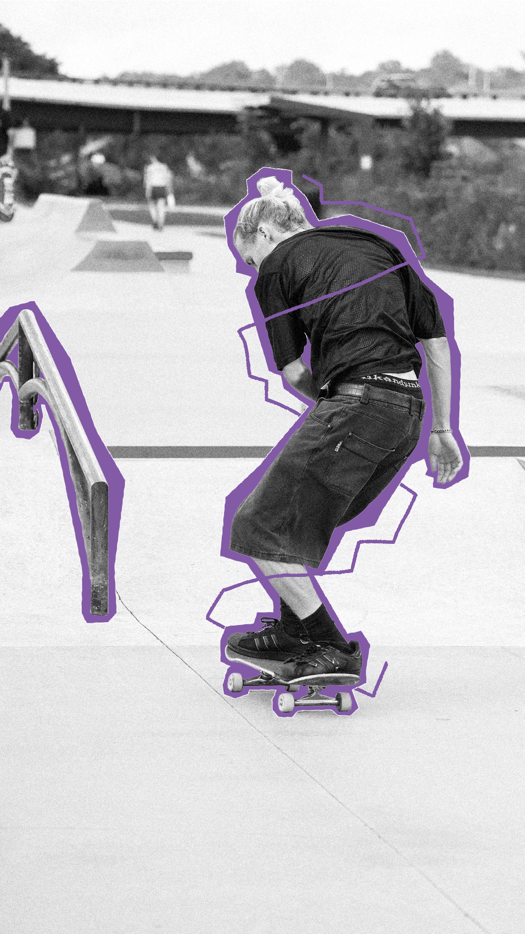
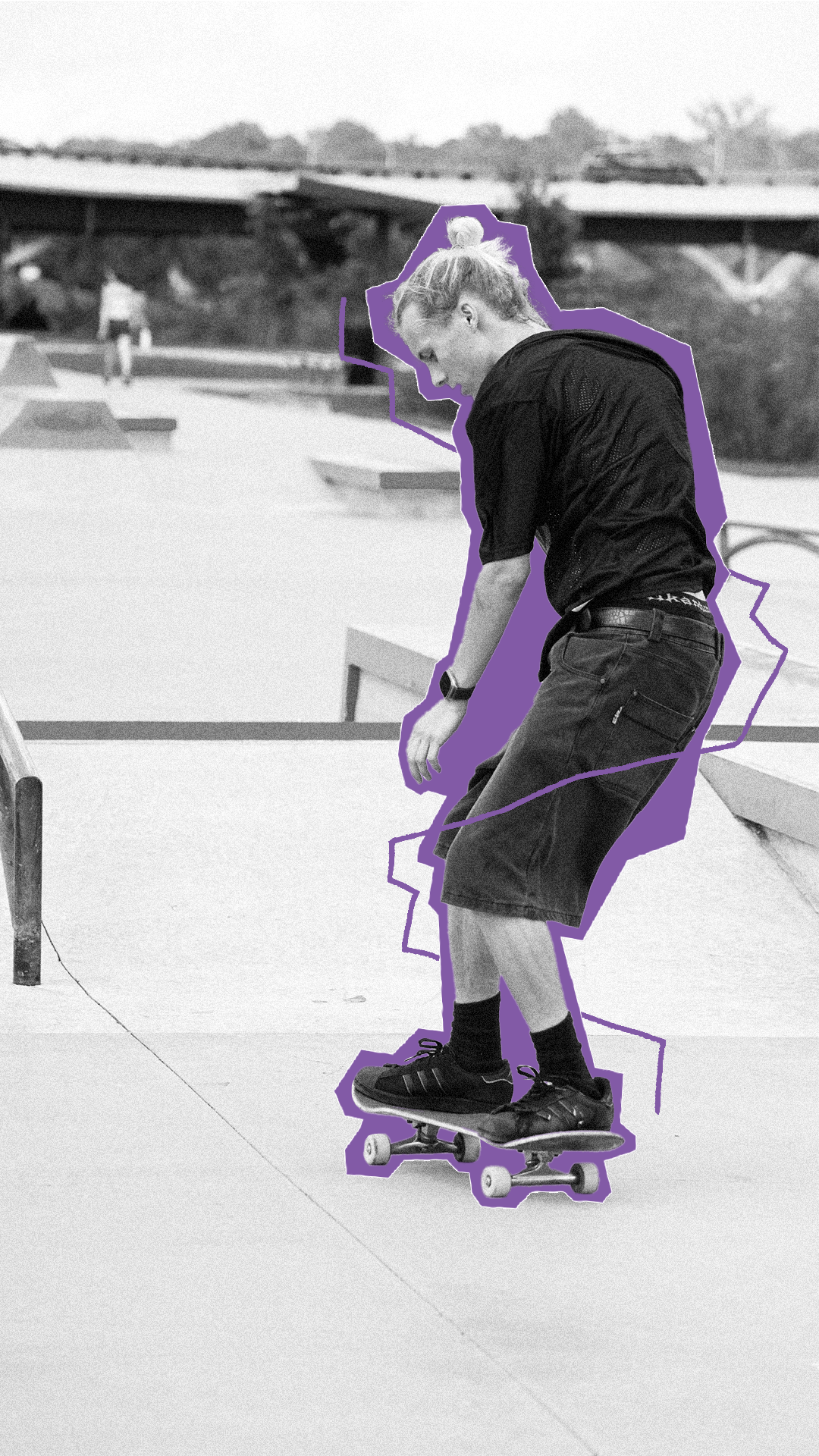
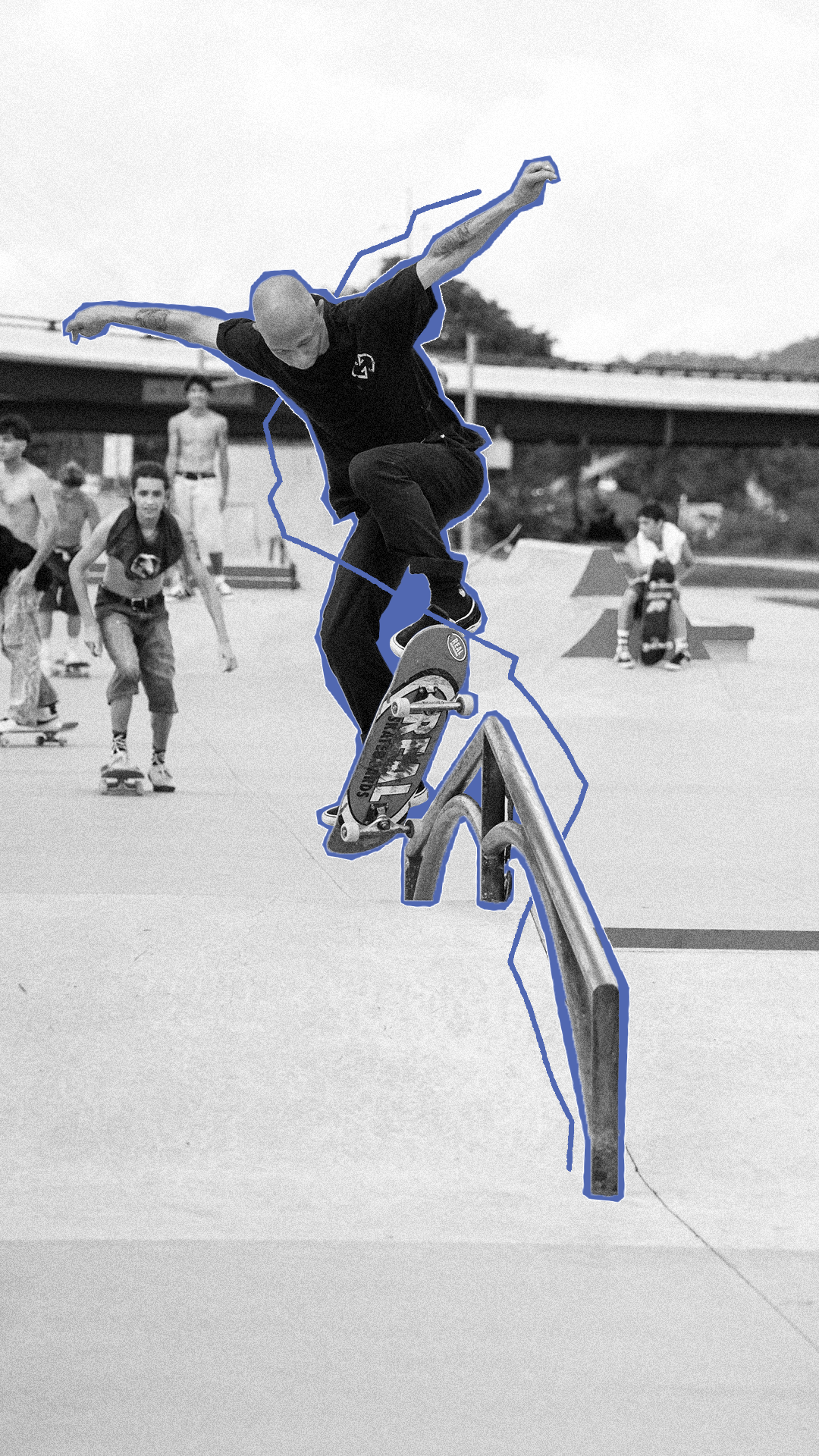
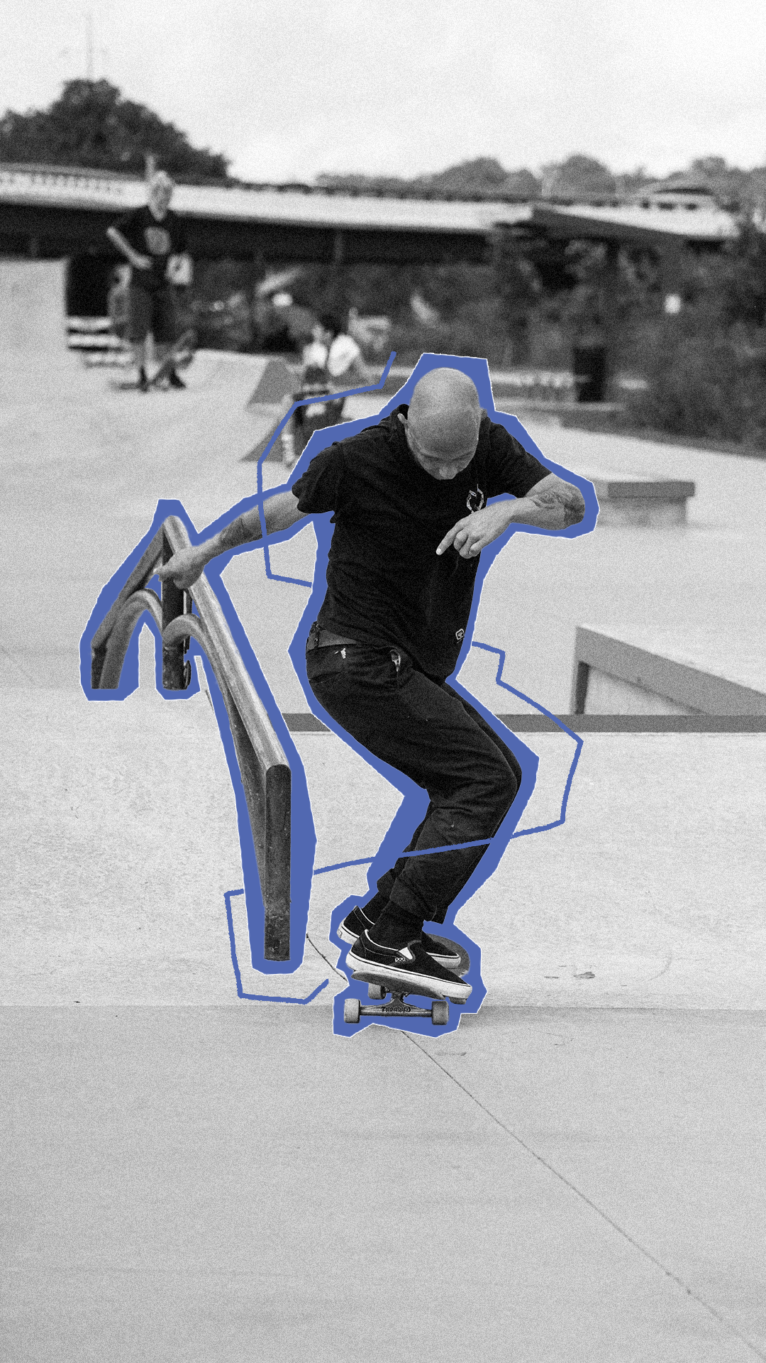
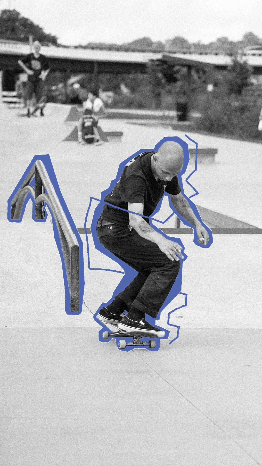
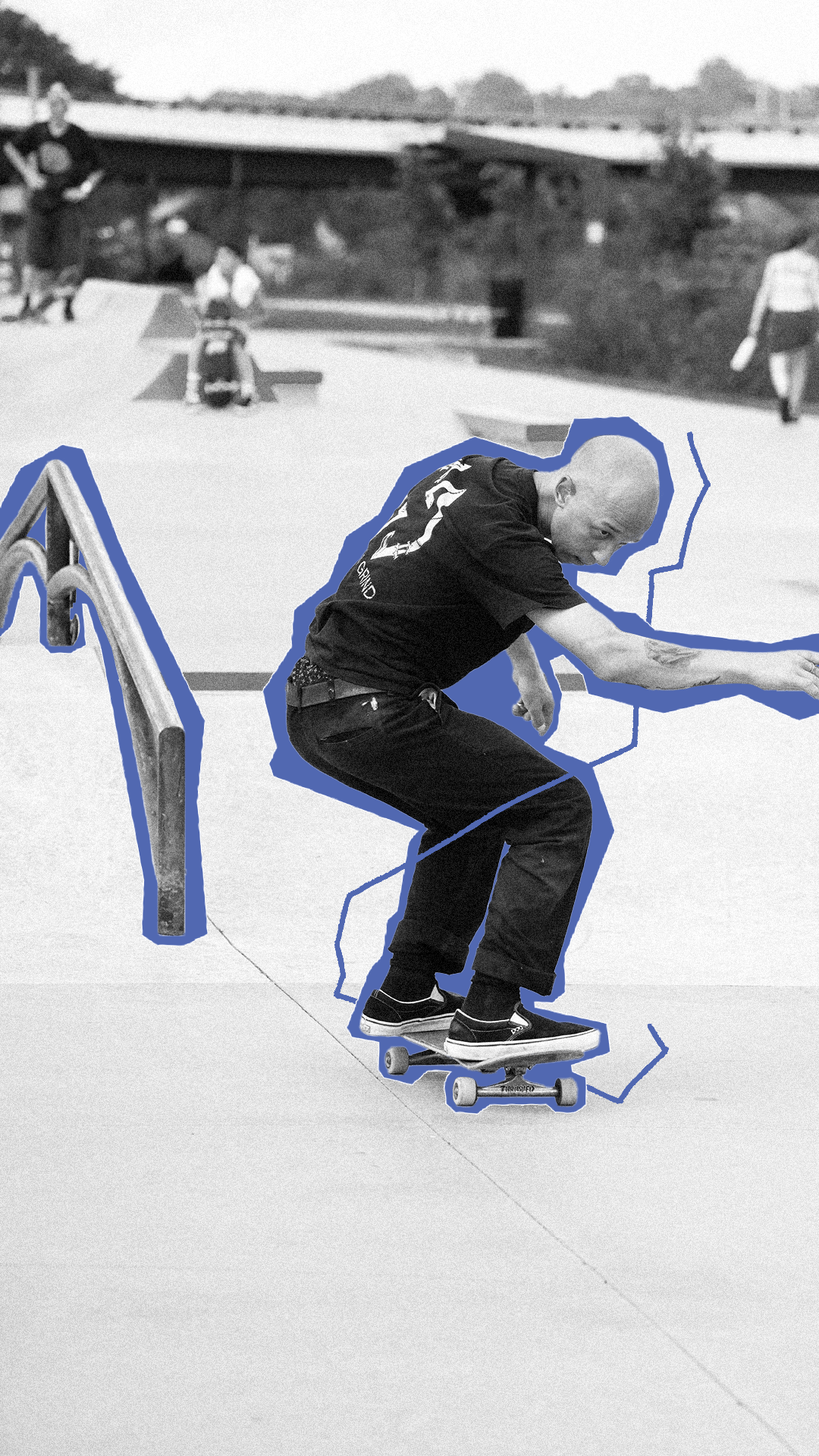
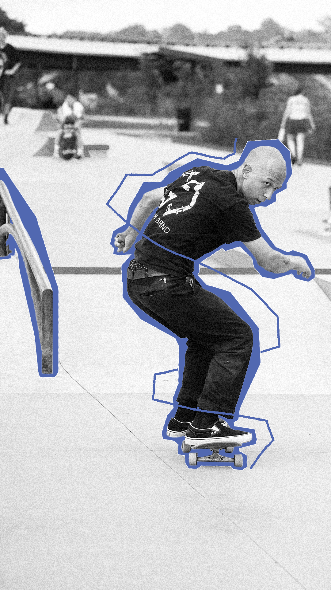
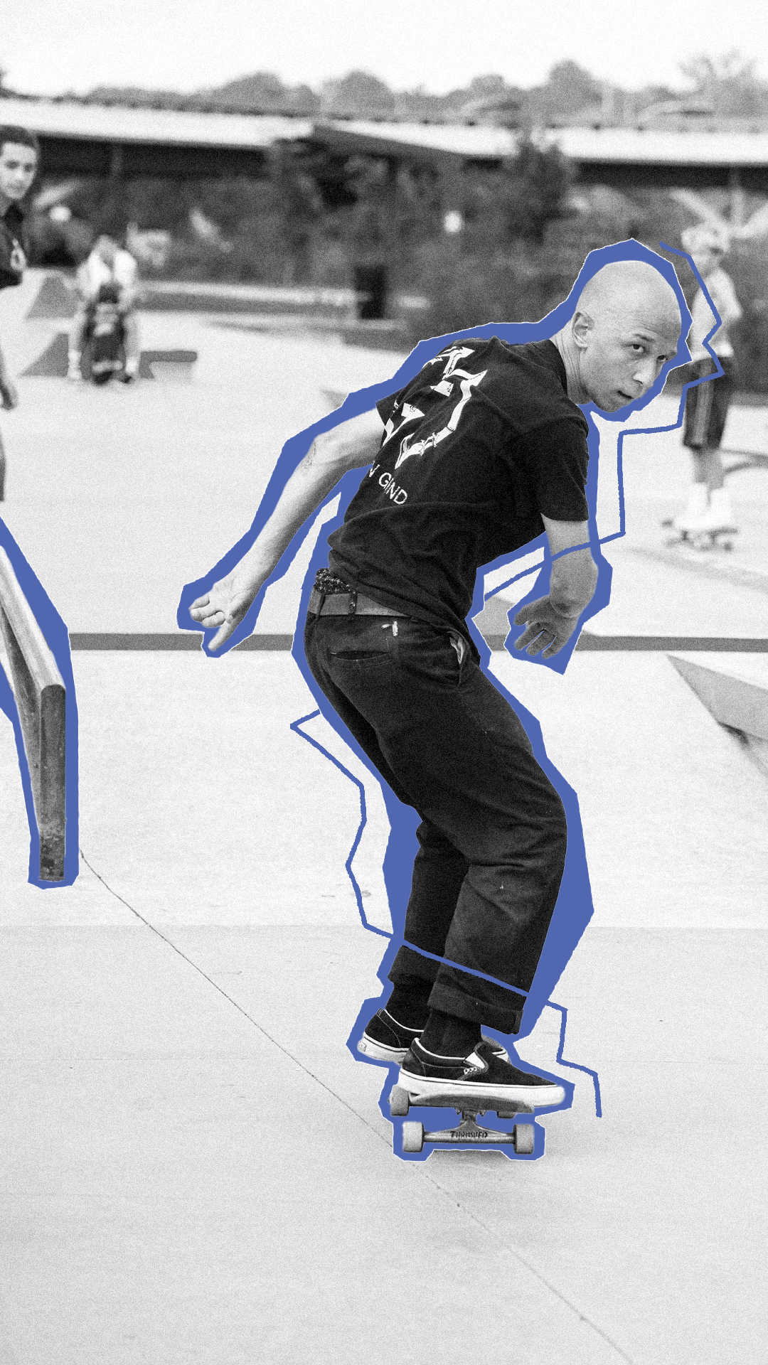
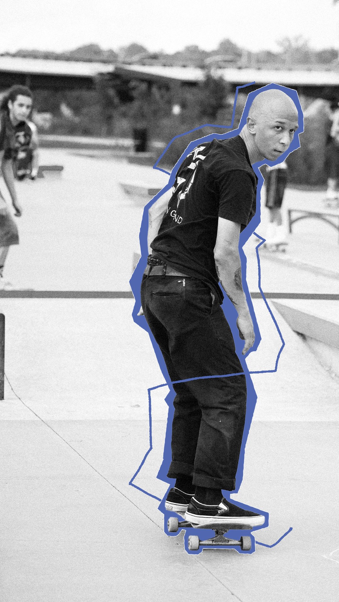
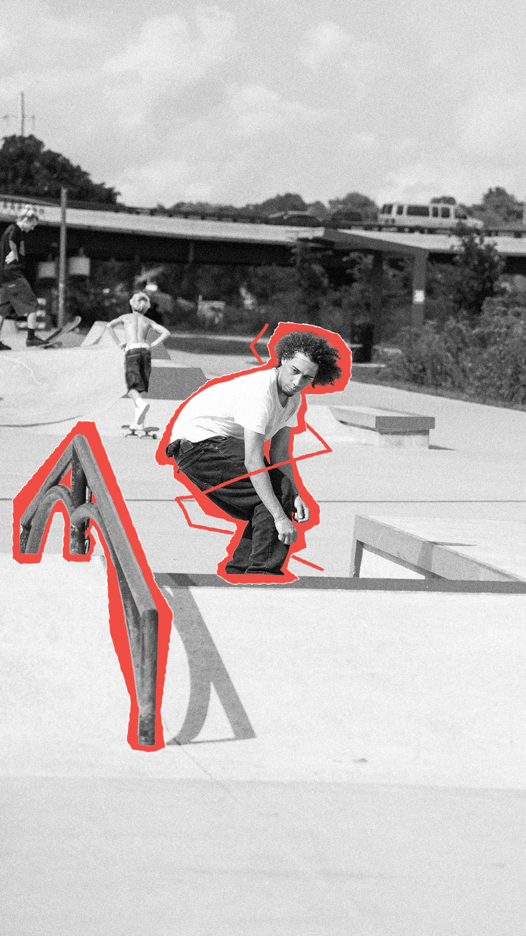
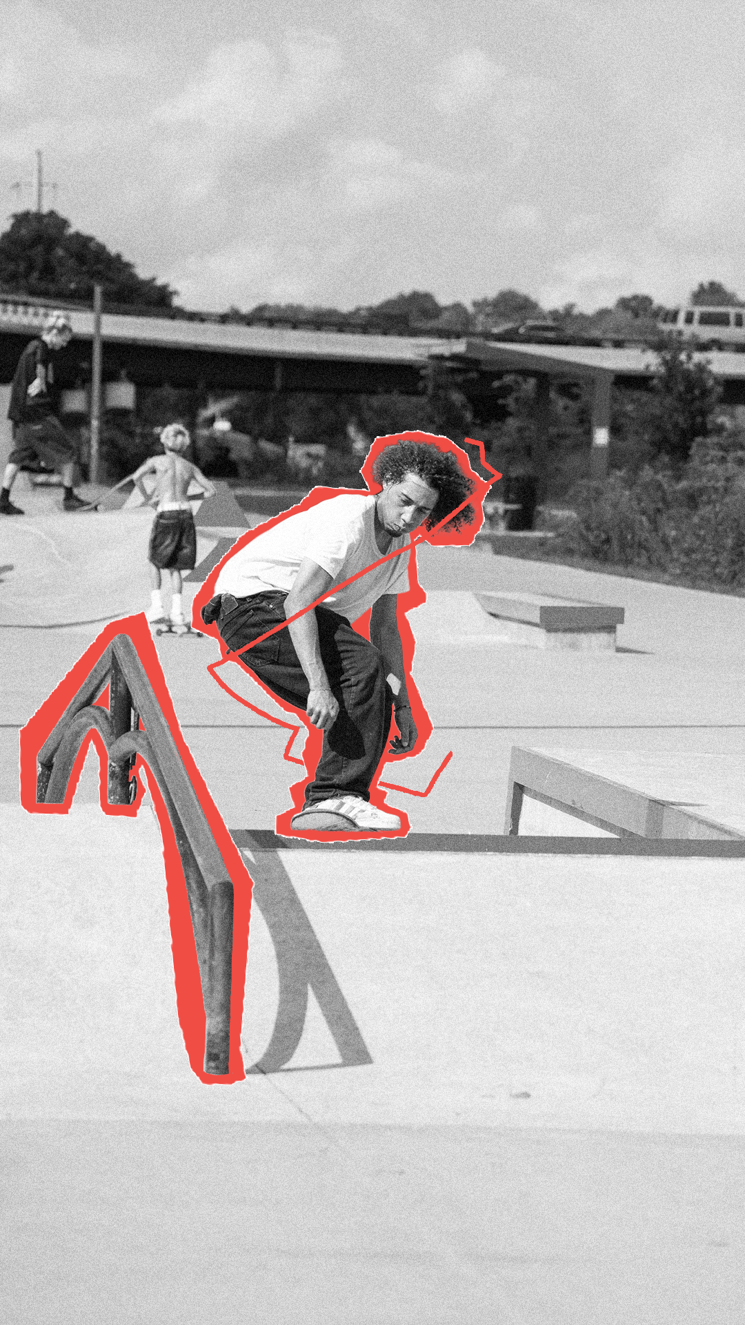
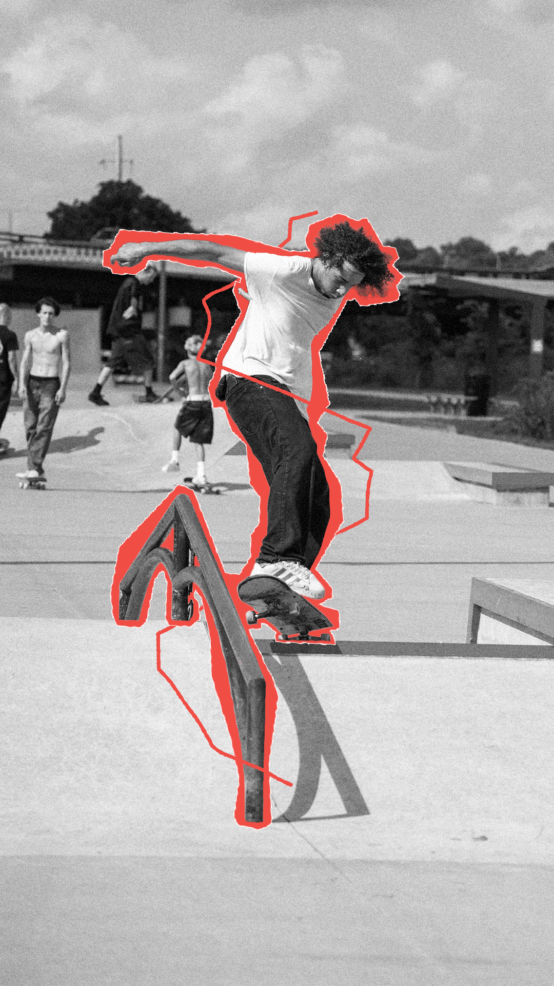
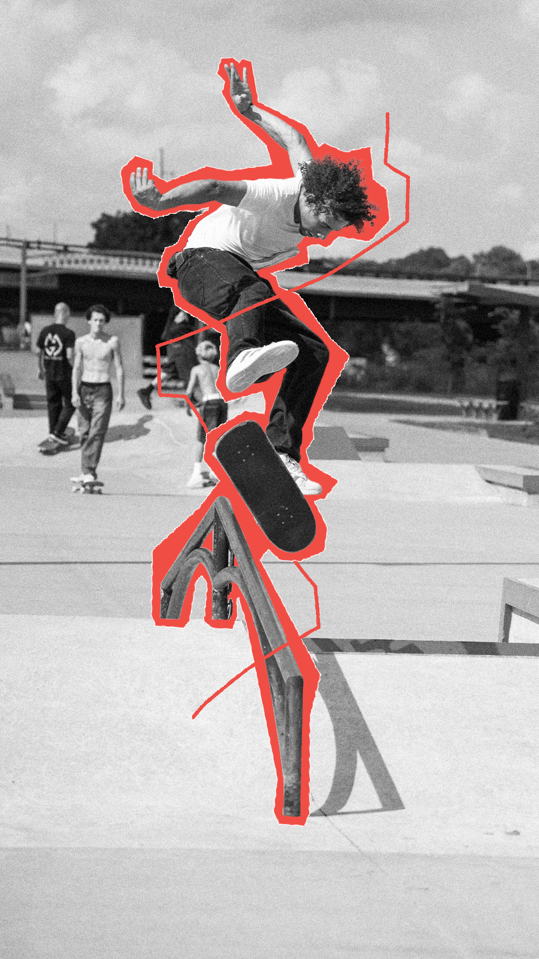
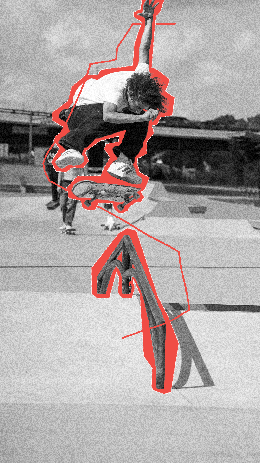
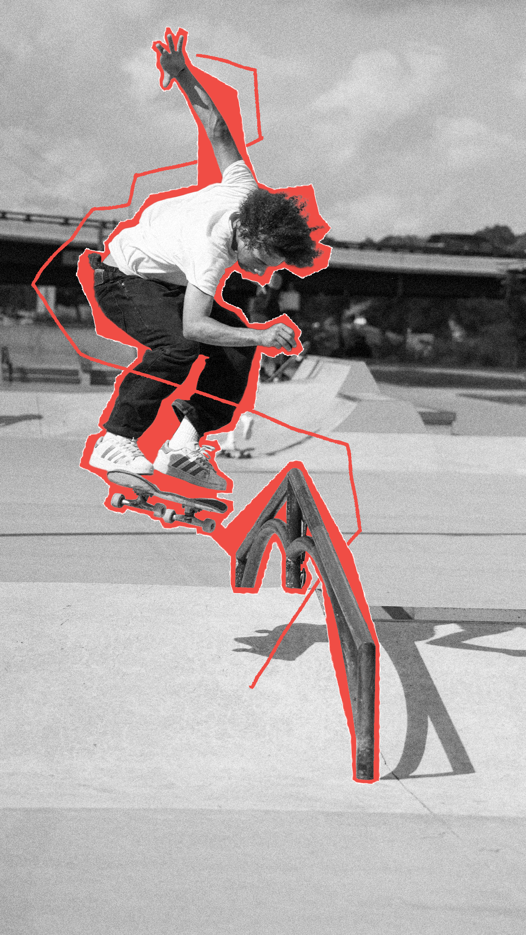
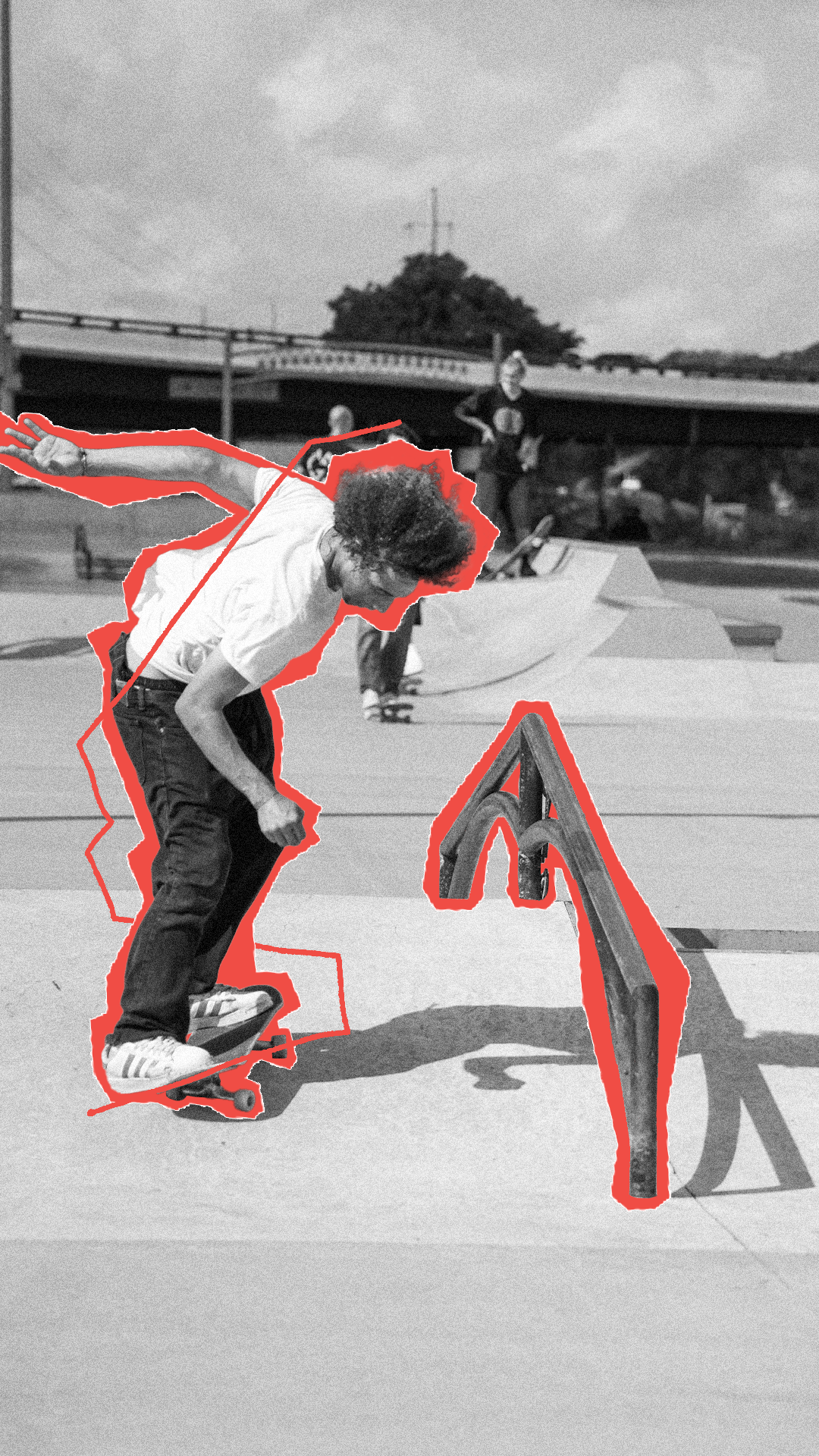
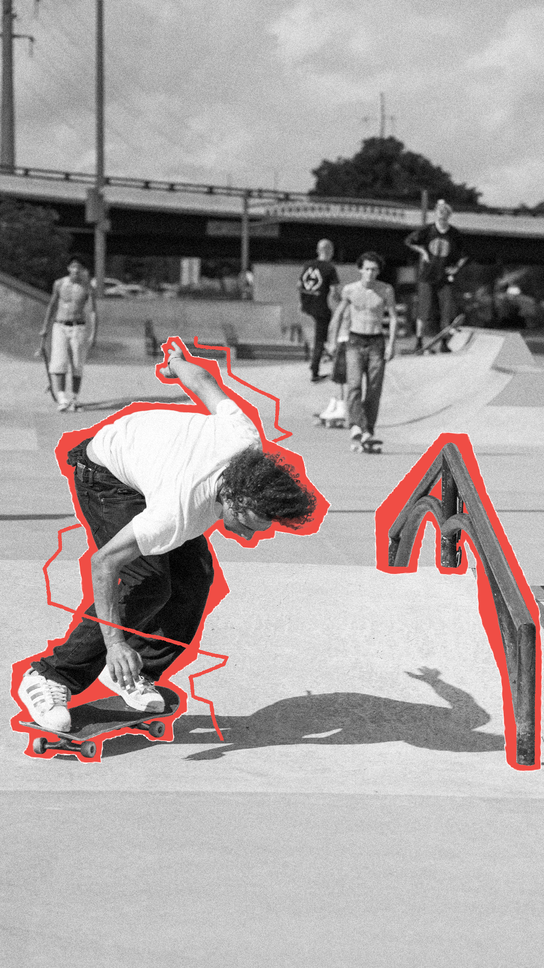
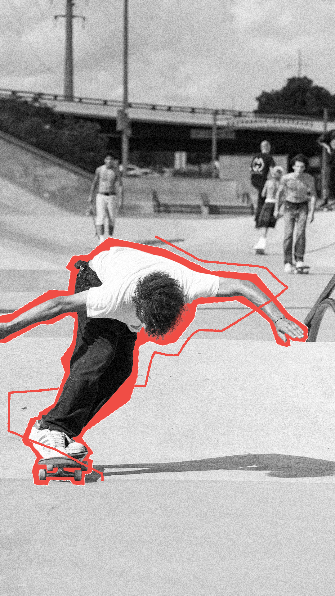
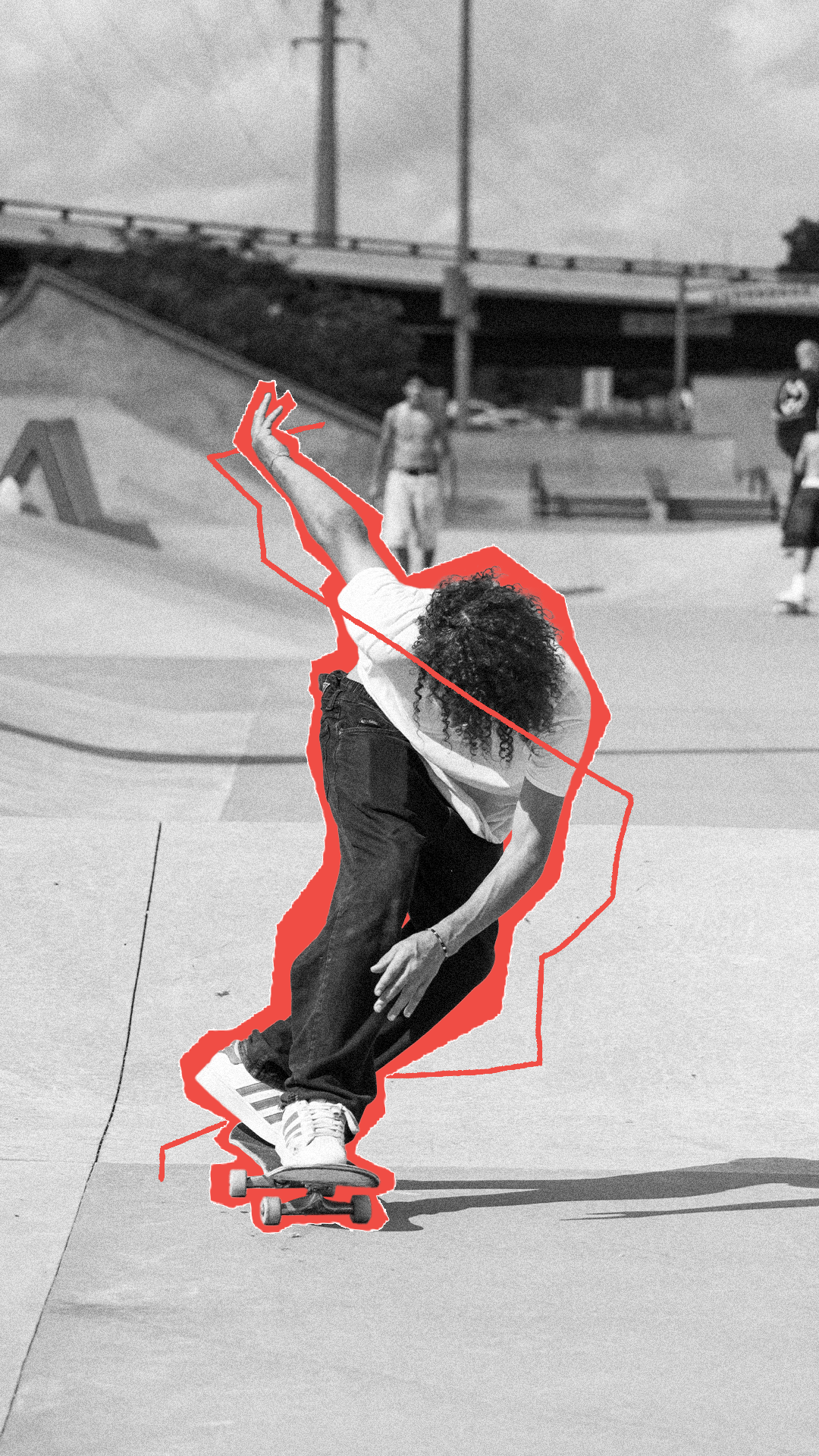
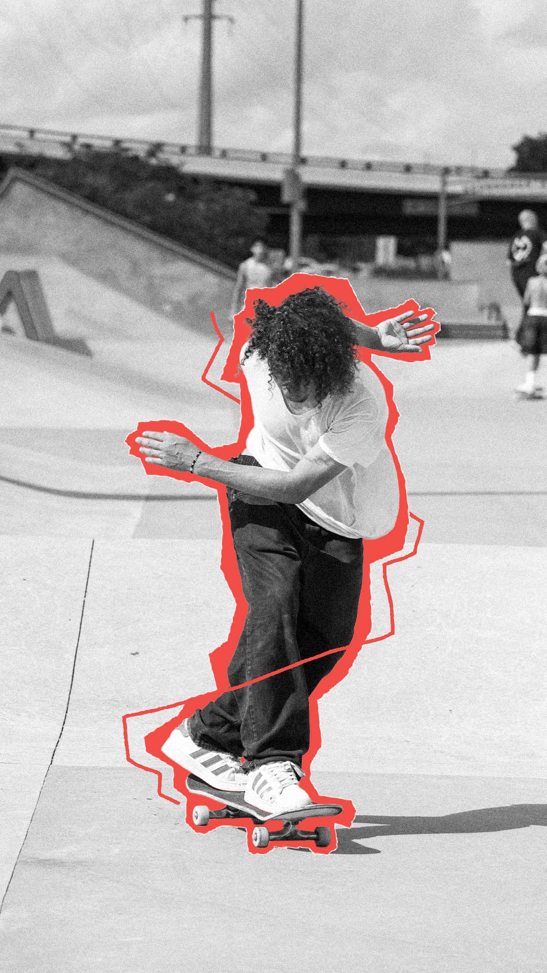
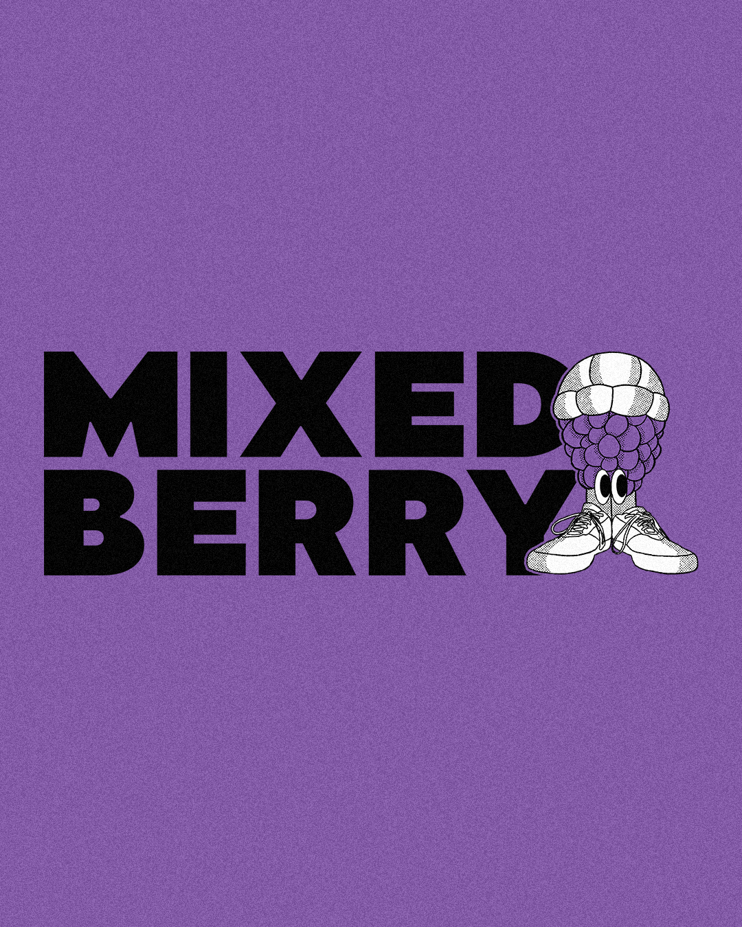
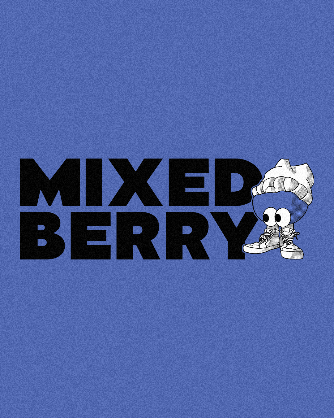
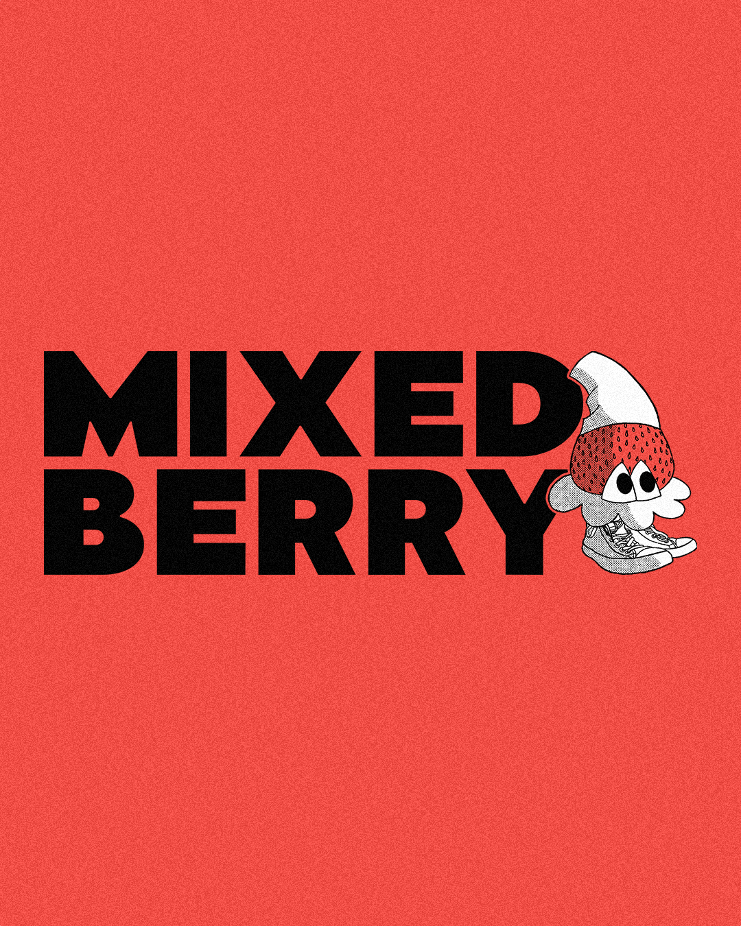
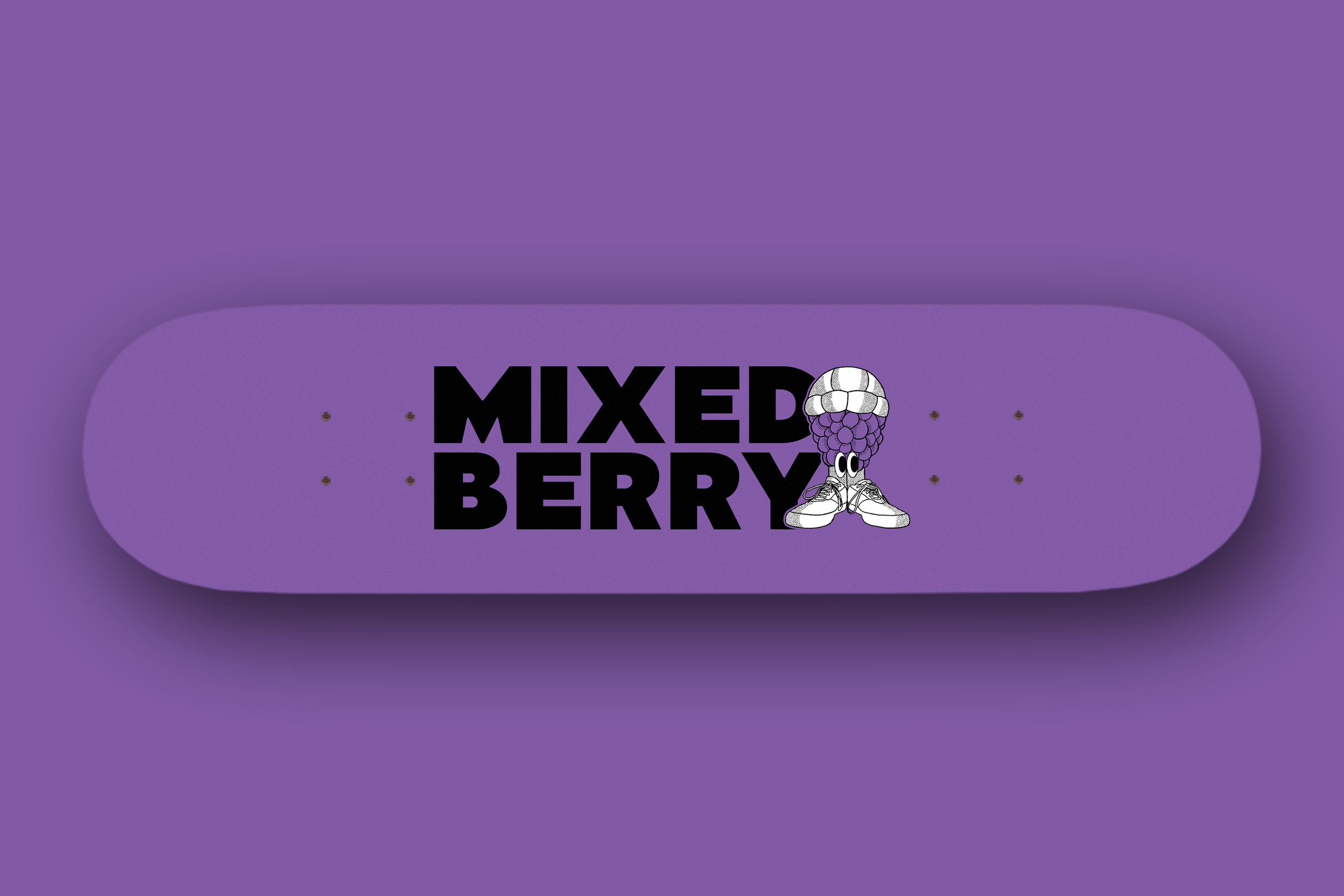
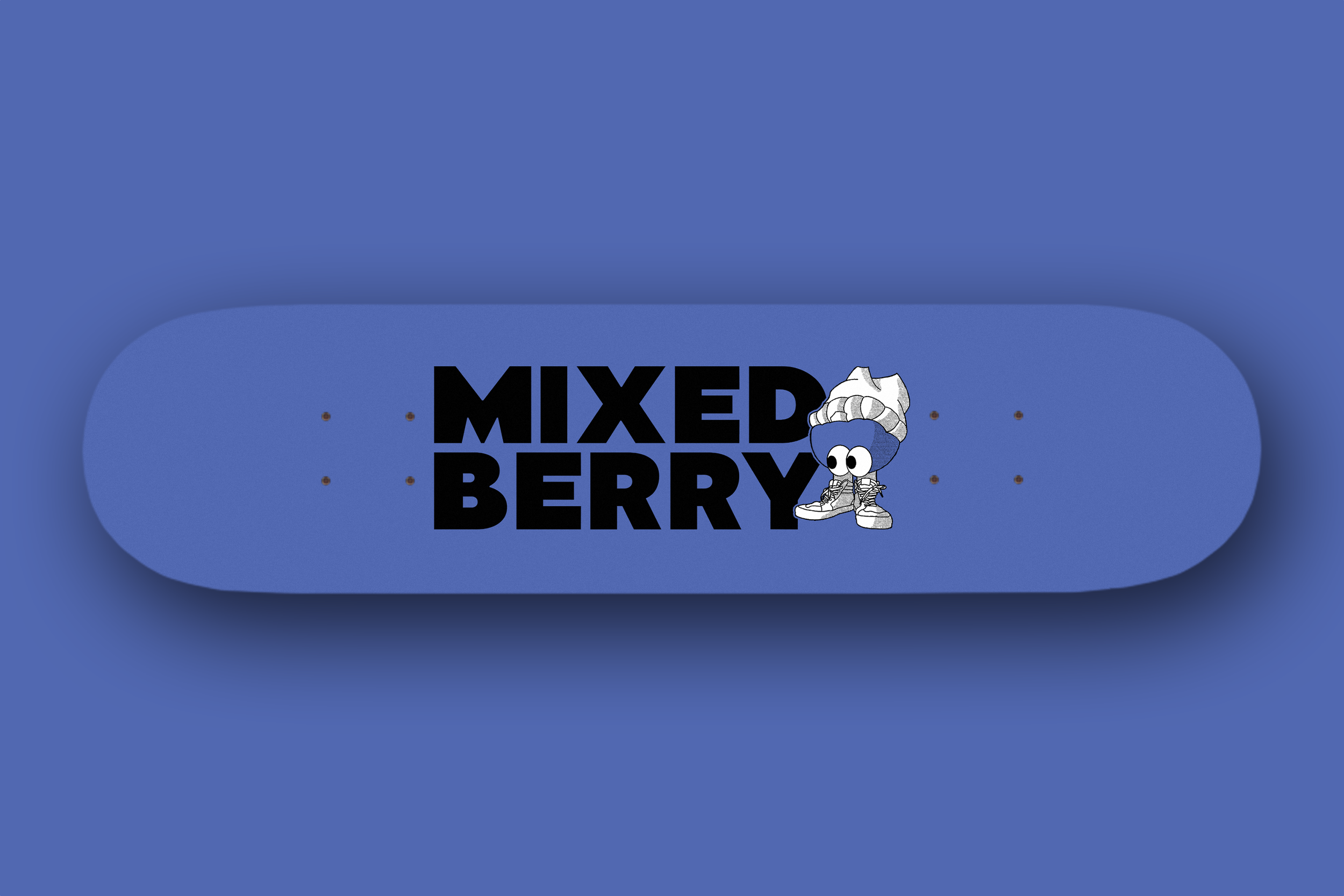
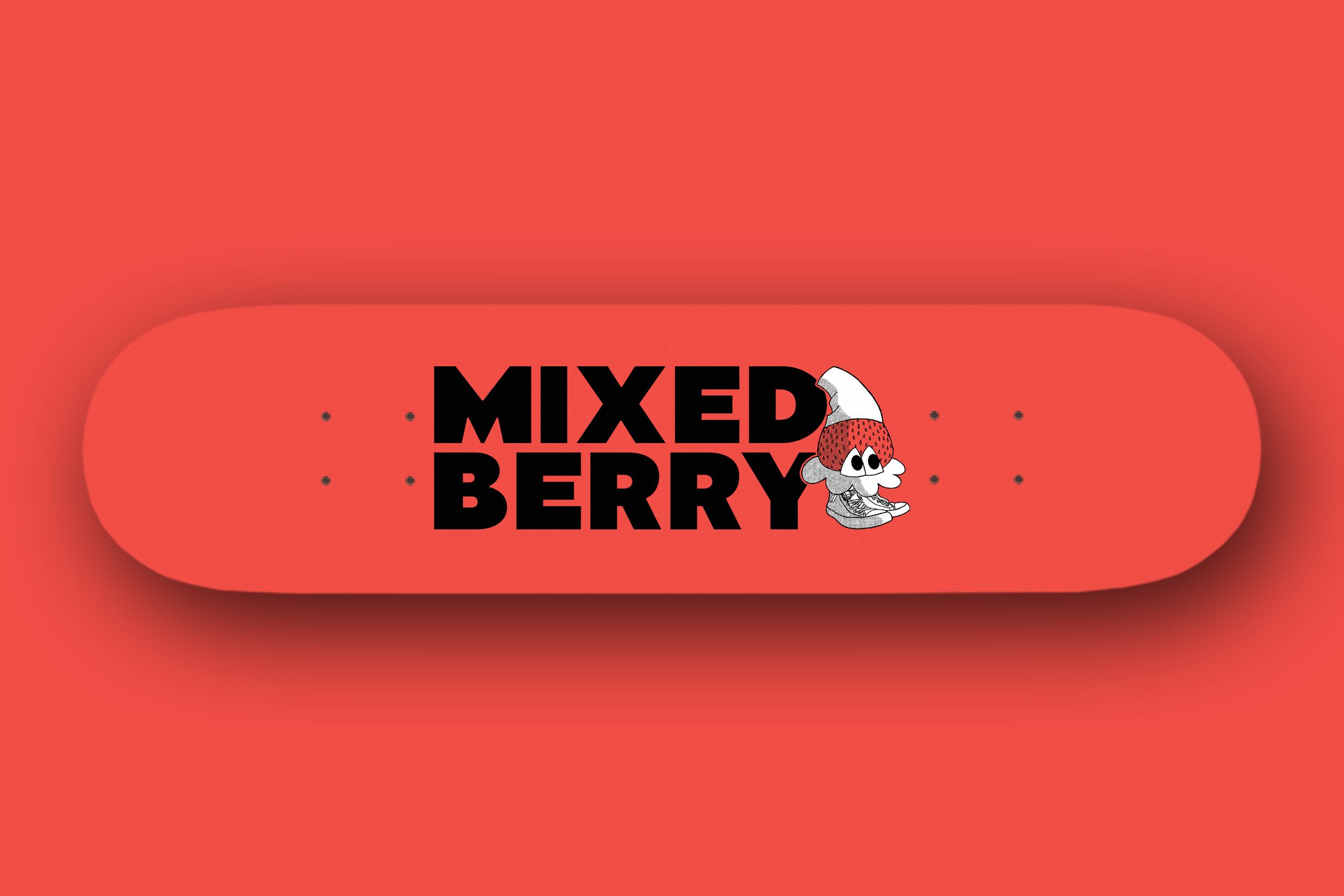
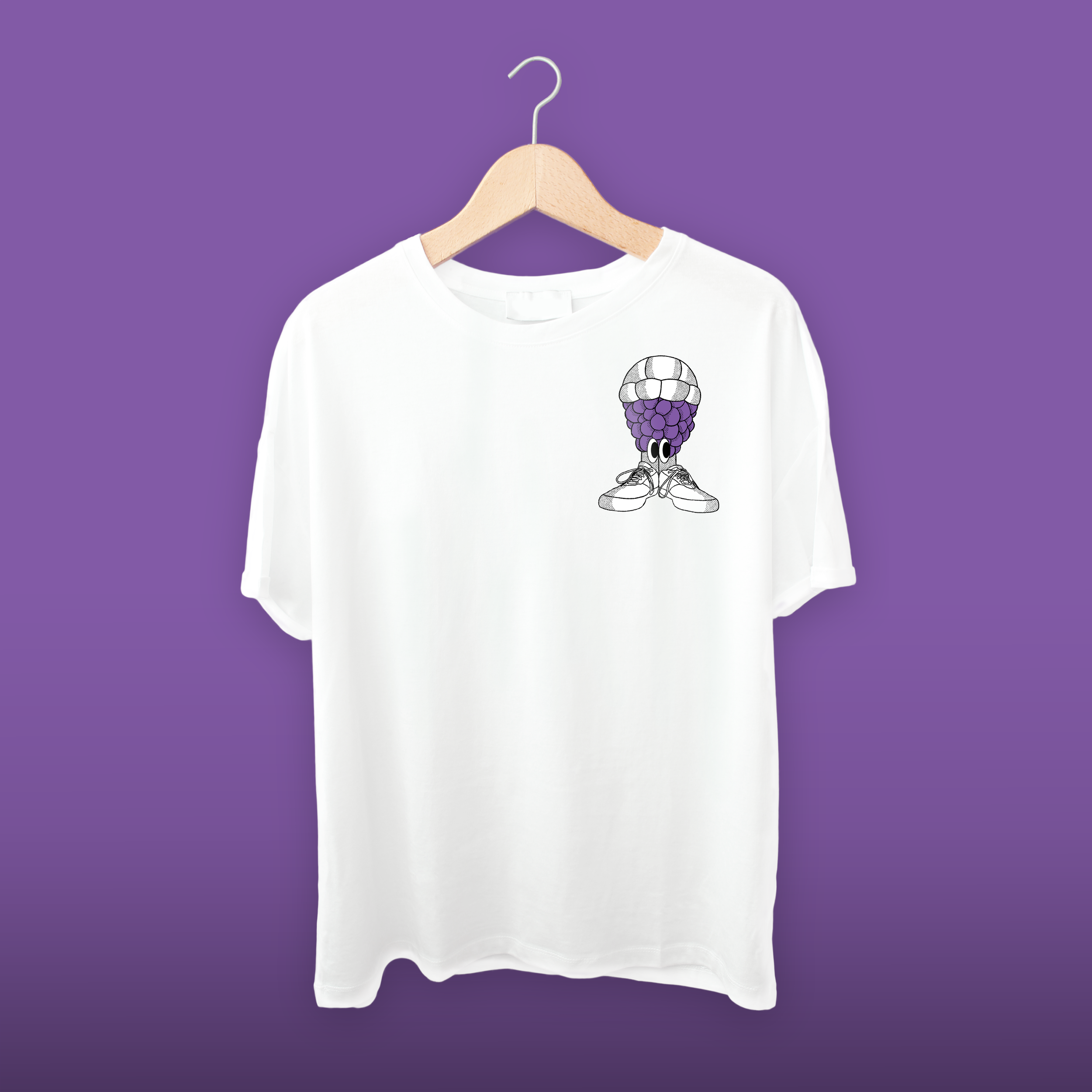
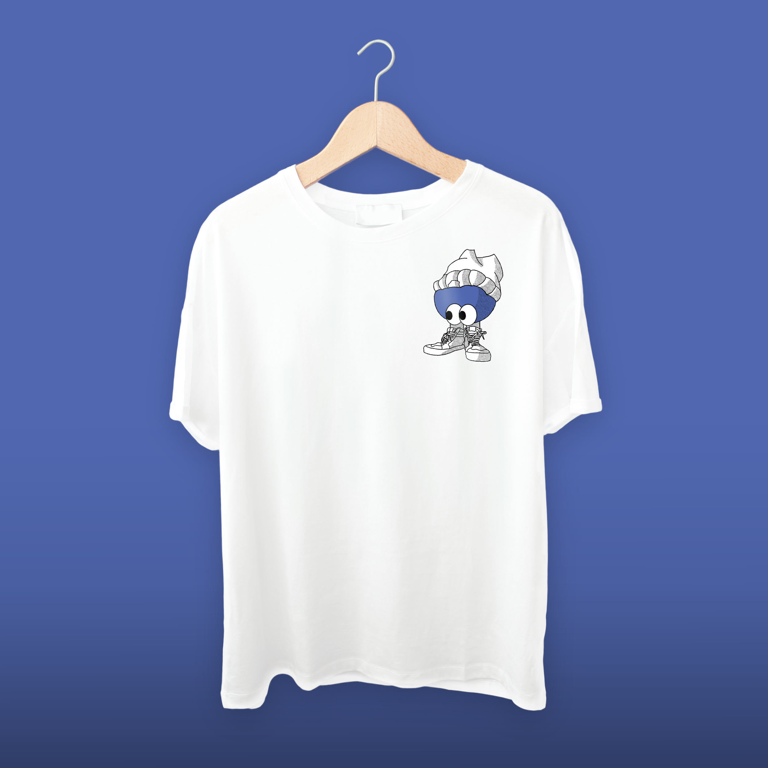
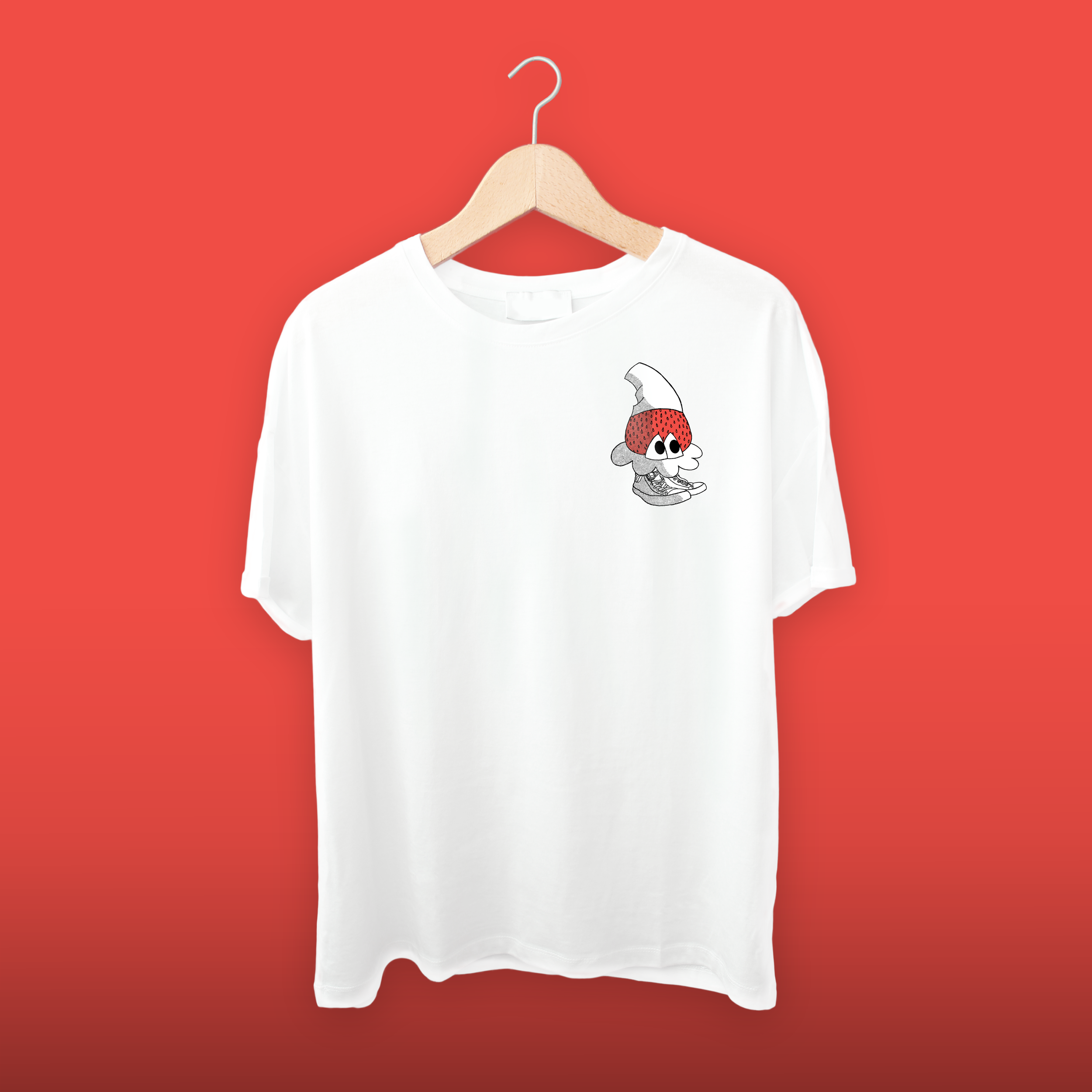
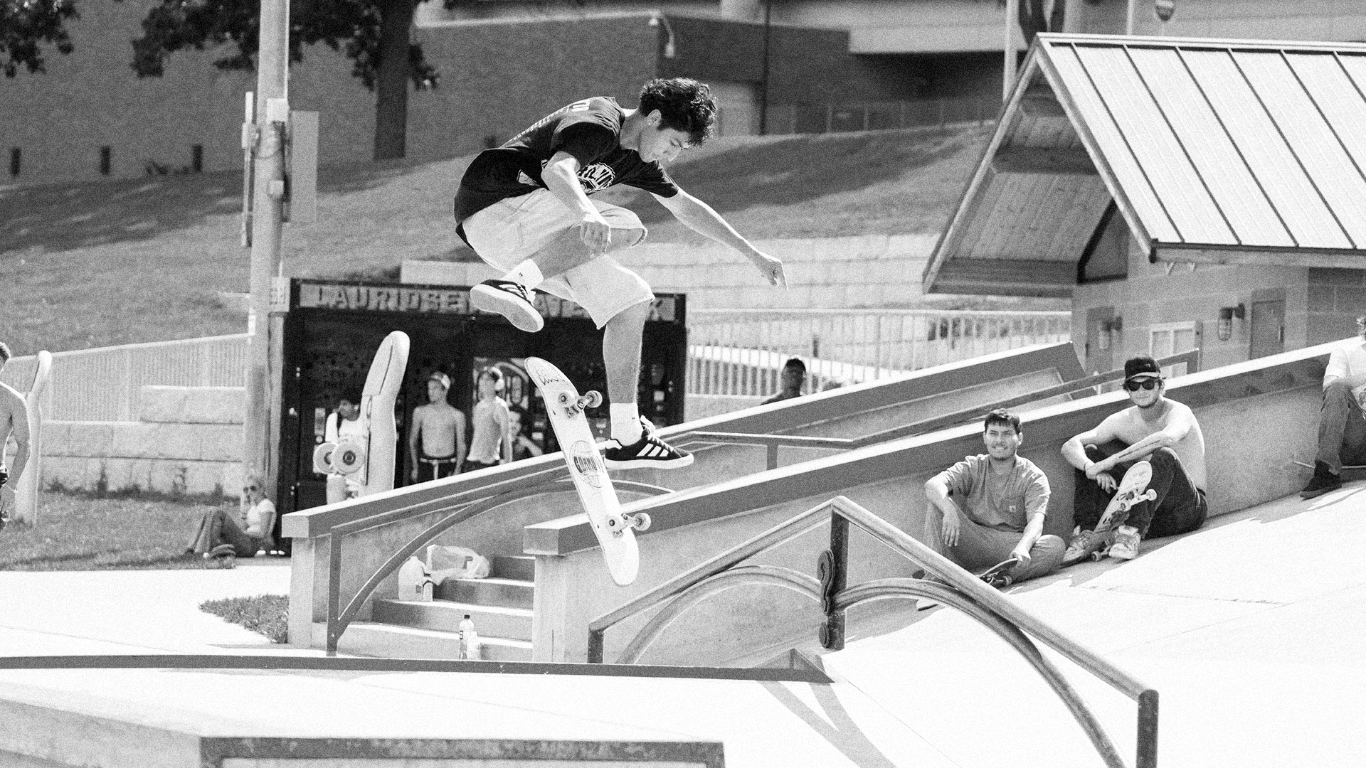
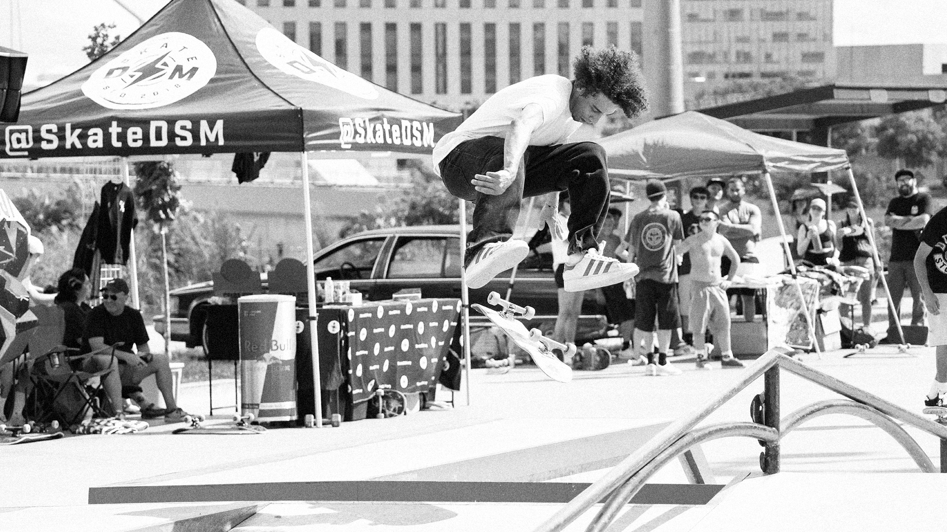
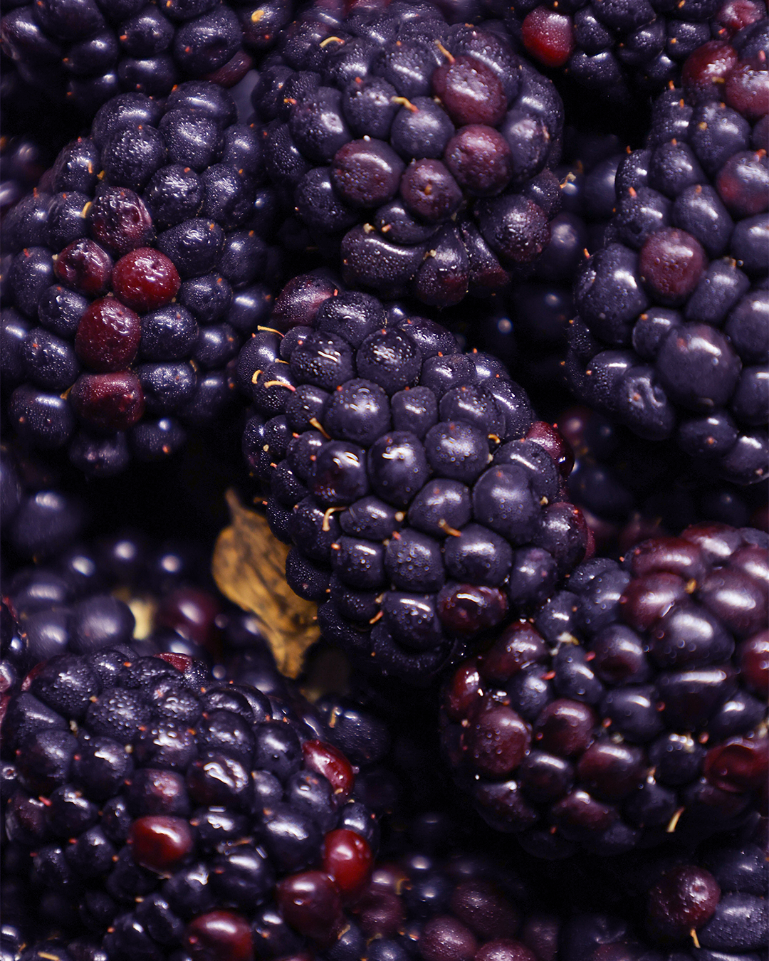
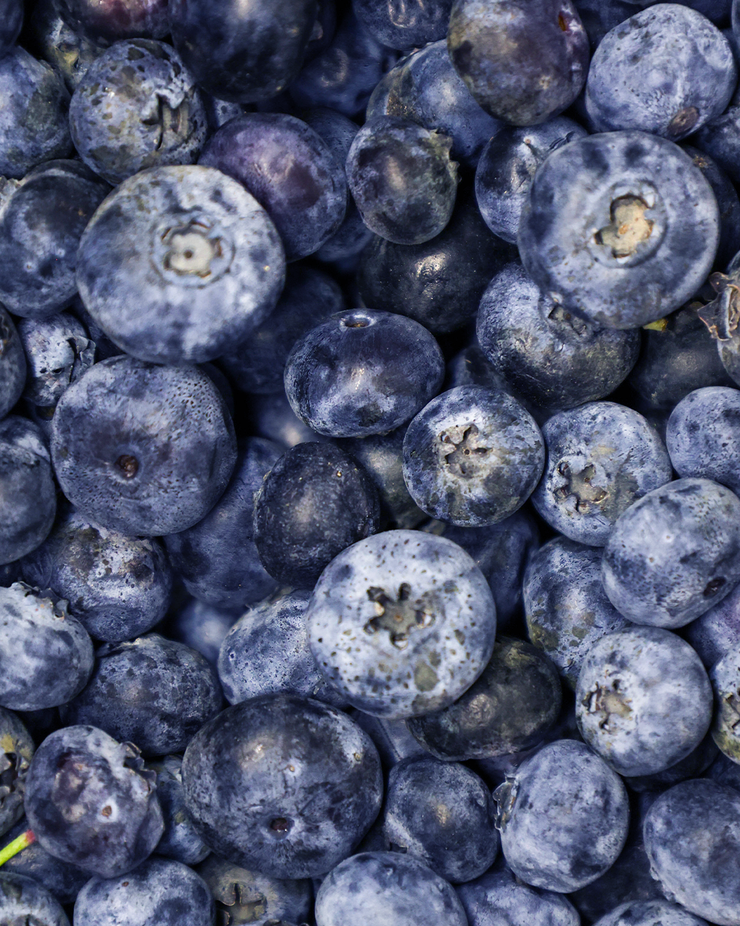
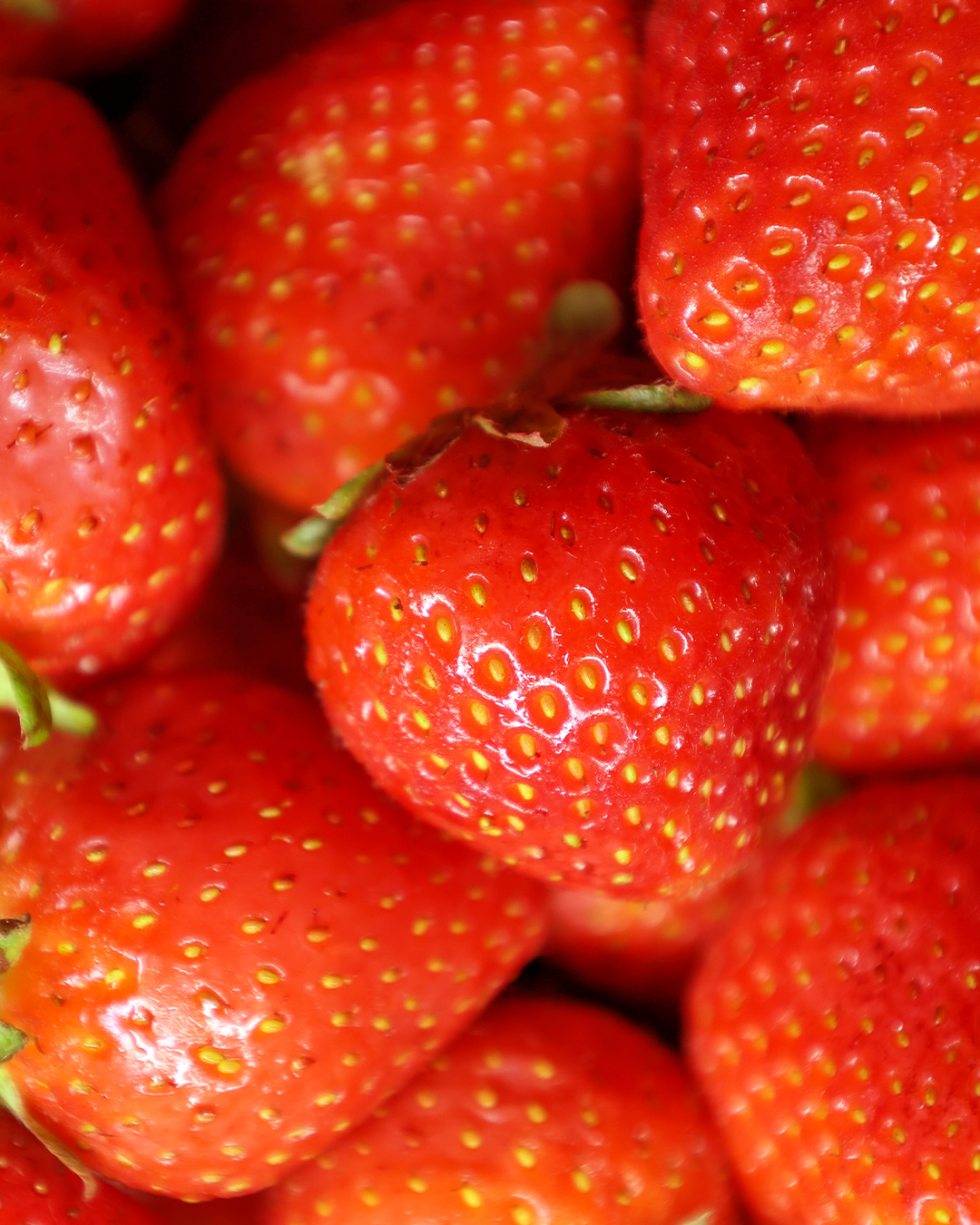
Mixed Berry Skate Co is my largest personal project to date. It all started with collecting my own assets, specifically attending skate competitions and collaborating with local skaters that I know personally, to collect a massive amount of photos to use throughout the project. I then came up with a name, inspired by the diversity of skateboarding I thought “Mixed Berry Skate Co” was fun and memorable! I developed the logos rather simply, with custom bold typography and a trio of circles as a badge or icon. Choosing red, blue and purple as the brand colors representing different popular fruits (strawberry, blueberry and blackberry). I then developed characters as a secondary logo, which would be the driving visual force behind the brand. Coming up with a tag line or motto was really fun, “Made To Bruise” was the result of that, and led the development of the graphics I came up with. The idea behind the stationary graphics specifically was to make labels for jam jars, I took my own photos of fruit to surround the outside of those graphics to make it look like the rest of the graphic is a label on the front of a jar. I then proceeded to make animations, put my graphics on t-shirts and boards and came up with a variety of other digital assets I hope you enjoy checking out!