
all I do is design album covers
Hi everybody! Thanks for clicking on this. Since March 23rd, I have posted three brand new album cover for three different artists. In this blog post I want to talk about each of them!
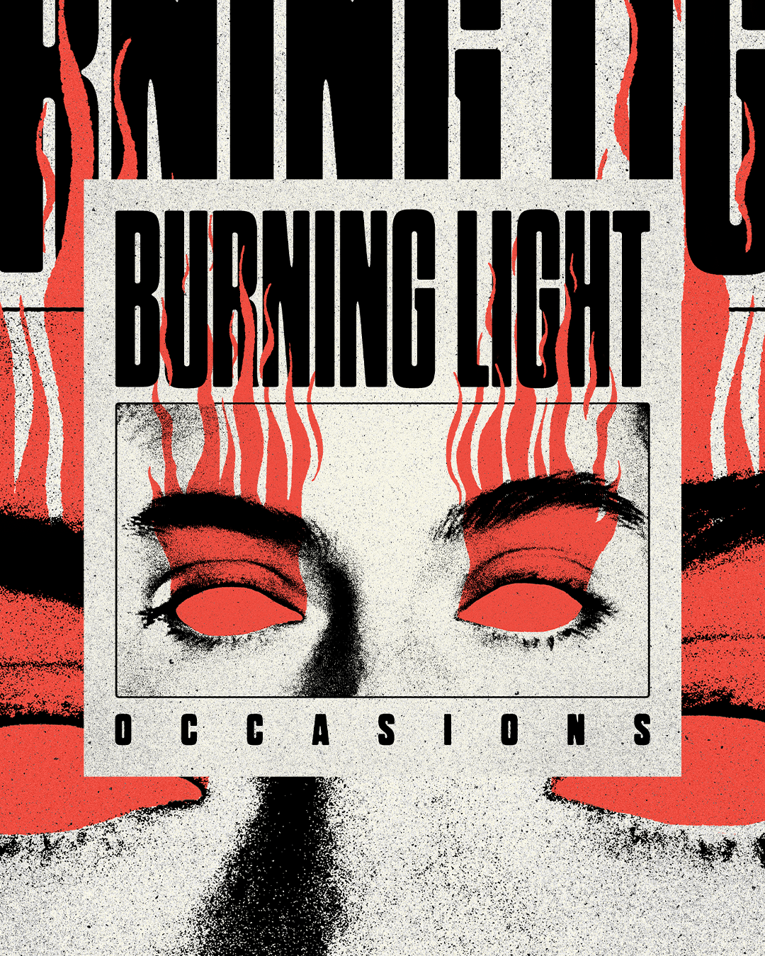
The first one that was posted was for the band Occasions, and their new single “Burning Light”. They are an awesome high energy rock band out of Venice, Florida. Working with this crew is always such a joy, and of course their music rocks.
This cover art does mean a lot to me as well, the song itself is inspired by Dantes Inferno, which is a pretty intense inspiration. The song reflects that well, it’s about being held accountable, truth, and having to confront yourself. Naturally, all variations of this album cover featured flames. Eventually these variations led to flames bursting out of our mystery persons eyes, symbolically representing the title “Burning Light”. Dharma Gothic was the font of choice, it fit absolutely perfectly. Being inspired by old wood type, using this font in combination with a paper-ish off white background really tied the whole thing together. My favorite little detail is the flames weaving in front of and behind the typography!
The second cover art that came out the week after was actually designed first. I believe I sent the final over in early January. I appreciated the timeline a lot!
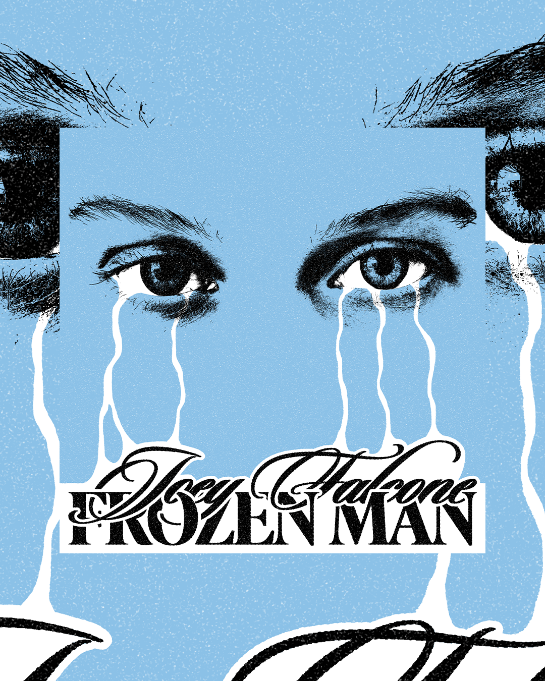
Joey Falcone’s newest single “Frozen Man” is all about losing yourself. Pulling a lot of inspiration from the early 70s.
Personally, I was super inspired by the lines in the song talking about how he feels like he is floating. I played around with a few different kinds of graphics, clouds and skeletons and odd symbolic type. Ultimately, an ice blue background featuring floating eyes came to be. Despite the song being titled “Frozen Man” they are actually a woman’s eyes, they tend to be much more interesting. The bottom of the cover features the typography for both Joey and the name of the song. Joeys name is written in Sloop Script, a classic that can weave in an out of whatever you need it to. It’s romantic, is beautiful, and it’s emotional. The second font for the song title features Ivy Presto, with some close tracking. I wanted “Frozen Man” to feel like a much more formal news header or at least give the feeling of intelligence through an academic look.
Most of the time I am a huge hater on holding shapes for typography. That being said, if the typography can interact with the imagery through said holding shape, all of a sudden I am much more interested. In this case, it is illustrated tears filling up the bottom of the cover, revealing the typography. It kind of feels like a sticker too. No matter which was you perceive it, I hope you like it!
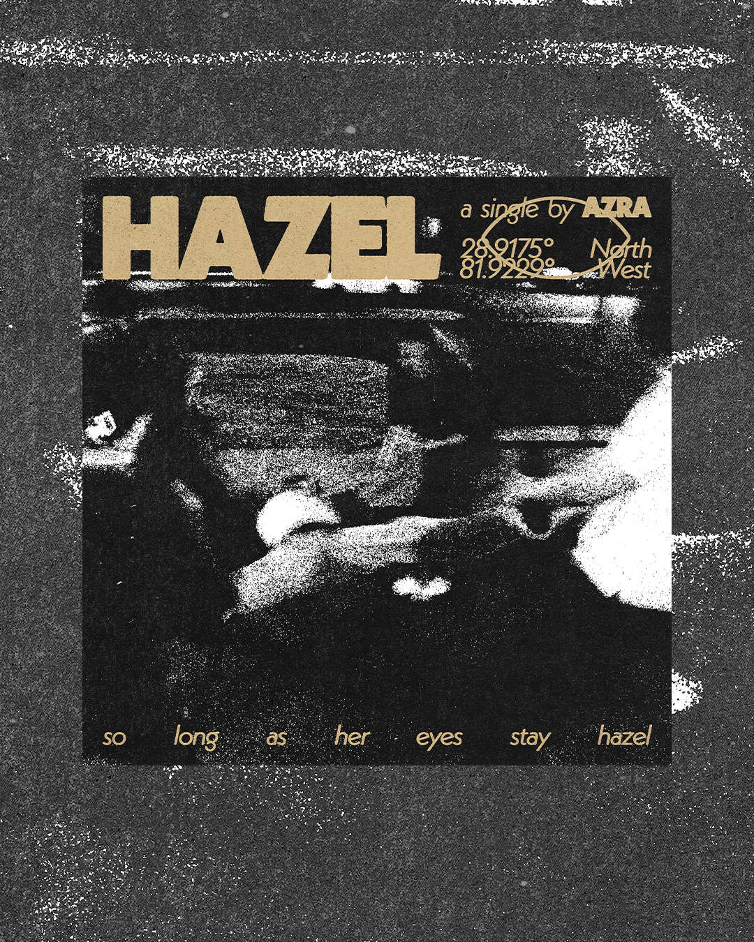
The most recent cover art I have posted features the artist Azra, and his new single “Hazel”. A midwest emo inspired love song, about the ever changing eyes of his partner. The entire cover was inspired by the line “so long as her eyes stay hazel”. It is a single I would describe as being very raw, and unapologetic. It is a demo, which is what Azra prefers posting. He’s just a guy, with a guitar, putting poetry into motion. So cool.
Neue Kabel is not only the font you are reading right now, but it is also the font featured on the cover. In all caps and bold, it is a reference to punk albums. Its much thinner variation provides an interesting and satisfying contrast. Paired together, with an ink bleed effect I absolutely fell it love, it just felt right. Taking this geometric font and softening the edges tells its own story. My favorite little detail is the eye shape interrupting the typography, it became a symbol for the entire digital campaign.
The image on the cover was requested to be used by Azra. It is a blurry iPhone photo, of his homies picking him up and spinning him around. After adding my own grunge flair to it, the end result is featured on the album. It is abstract, it is personal, and it could not fit the vibe of the song better.
If you enjoyed checking these out you will enjoy my next YouTube video even more. I have already filmed it, and I am currently in the editing stage. The video features my journey in animation. Spoiler, my favorite animations I have ever done are in context to the album covers featured in this exact article. Those animations can be seen when you play the songs on Spotify. Of course, I have many other cool animations I will be talking about. Several for other songs, skateboarding stop motion and hockey jumbotron assets.
Below I will leave my most recent music related YouTube video, it talks in depth about the process for the first cover art I ever designed. If you like it, make sure to subscribe to see the video I mentioned in the paragraph above.
As always, thank you so much for hanging out, I will talk to you soon! God bless.
- Judah