
Band Posters, Branding & A Card Game
What a month! I feel all sorts of caught up with smaller scale projects. My favorite thing to do is make art in any context you can think of, and document it on video for YouTube. The last couple months I haven’t had a chance to do that! I had to lock in on a couple smaller projects, that only would have been prolonged by filming and editing up that footage. They would have been videos I would not have been as excited about either!
The good news is that this blog post feels like the last small thing I have to do before I start producing my next video. Skateboarding related, you can expect by the end of October hopefully. I will be writing the script this afternoon!
The first project I want to talk about this blog post was kind of featured in last months post. It was the branding of Wilson Street Productions. What I was able to put together was so fun that it now has its own section on my portfolio page, which you should totally check out since you are already on my website. I had the chance to design t- shirts and business cards, and get a couple of my friends to do some modeling. I am really excited about how it turned out, and even more excited I get to check it off my list as it was long overdue.

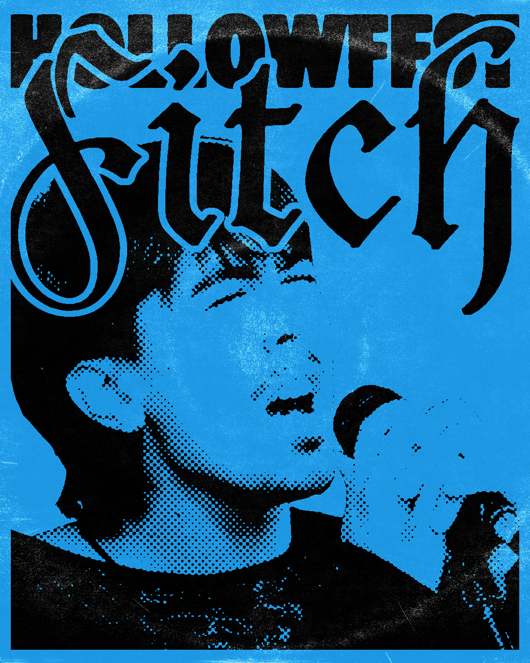
Next, while I have talked about this on my social media it is certainly worth mentioning here. My barista (at my local Starbucks that I admittedly visit all too often) is in a midwest emo band. You could at times call it punk rock as well. I learned this about him after spending enough time drinking my matchas in there, and naturally I brought up that I am an artist, more specifically a designer. In response to that he told me about “Hollofest” - a one day punk rock music festival hosted by a farmer in the middle of nowhere Iowa.
I immediately jumped at the opportunity. I not only went to this music festival and enjoyed my time, but for my baristas band “Fitch” I shot photography, with the end goal of making graphics for them to post. You can find all three of these graphics in my “Experimental Design & Illustration Gallery” section of my portfolio. Of course, I will also leave one below for you to check out.
Lastly, if you read this blog of follow my art accounts regularly you know I am in the middle of illustrating a card game called “The Ninth TCG”. A fantasy based card game with some really fun and fresh ideas. Of course something like this needs a logo, and I got the chance to design it. This is kind of a complicated situation though, as we have yet to figure out the face of the fantasy game. The “pikachu” of the franchise, and for those of you unfamiliar the word “mascot” would be suitable. So for this logo, it needed to be simple typography, as we wait in anticipation for the day our mascot will be created and agreed upon. I will leave the logo down below. The game is fantasy combat, equally fought with swords and shields as it is spell books. Using a blackletter style font in reference to the way people used to print old books and manuscripts, along with a hidden sword kind of hidden in the typography. I hope you enjoy its symbolism, simplicity, and the story it tells.
If you are unfamiliar with “The Ninth TCG” I will leave a video down below in reference to it. It is my most recent YouTube video, and it has been posted long enough that I may sound like a broken record sending people there. But it is truly my favorite video I have ever put together, and I am intimidated by the idea of trying to top it. Have a wonderful rest of your day. Thanks for hanging out. I will talk to you soon.